This article is the companion guide to Episode 71 of the Intelevo YouTube series. Watch the full video walkthrough above, then use this article to review the steps, revisit the code, and take notes at your own pace.
In Episode 70, we broke down how K-Means clustering works. We watched points join their nearest center, then watched centers slide to the average of their group. That loop felt almost magical. But it left one loose thread dangling: where does K actually come from?
Today, we pull that thread. By the end of this article, you will know exactly how to pick K using the K-Means elbow method, and you will see the Python code that makes it happen.
A Quick Recap Before We Move Forward
Let’s refresh the basics first. K-Means splits your data into K groups. It does this by repeating two simple steps.
First, every point joins its nearest center. Then, each center moves to the average position of its group. The algorithm repeats this loop until nothing changes anymore.
That part never changes, no matter the dataset. However, one input always stays fixed before the loop even starts: K itself. You hand K to the algorithm upfront. K-Means never questions it. It simply executes.
So the real question isn’t how K-Means groups your data. It’s how many groups you should ask for in the first place. That’s exactly what we tackle now.
The Everyday Problem Hiding Inside This Question
Here’s a simple way to feel this problem before we calculate anything.
Picture yourself packing a suitcase. Your first few items matter enormously. You pack your clothes, your charger, your toothbrush. Each item adds real value.
But somewhere around item thirty, things change. You’re now squeezing in a second pair of sunglasses that barely matters. The suitcase is heavier, yet your trip won’t improve much because of it.
Nobody gives you a formula for when to stop packing. Instead, you feel the returns shrinking. Eventually, you just stop.
That instinct has a name in data science. We call it the elbow method, and it works exactly the same way. Adding more clusters helps at first. Then, the help shrinks. Eventually, adding one more cluster barely changes anything at all.
Meet WCSS: The Number Behind the Decision
To automate that suitcase instinct, we need a number. That number must score how “good” a clustering actually is.
Enter WCSS, short for Within-Cluster Sum of Squares. Data scientists often call it inertia instead. Both names describe the same idea.
WCSS adds up the distance between every point and its own cluster’s center. Then, it squares each distance and sums everything together. Tighter clusters produce lower WCSS scores. Loosely scattered clusters produce higher ones.
Naturally, you might assume lower is always better. Therefore, why not choose a huge K and get the lowest score possible?
Here’s the catch: WCSS always drops as K increases. Push K high enough, and every cluster eventually shrinks to a single point. At that stage, WCSS hits zero. Yet your clustering becomes completely useless, since every point becomes its own group.
So a lower WCSS score alone won’t guide you to a good K. You need a smarter way to read it. That’s where the elbow method earns its name.
The Only Math You Actually Need
Good news: this entire method rests on one simple formula.
WCSS = Σ (distance from point to its centroid)²
That’s genuinely it. No hidden complexity, no advanced calculus. You calculate the distance between each point and its own cluster center, square that distance, then add every squared distance together.
However, we don’t stop at calculating WCSS once. Instead, we repeat this process for every candidate value of K. Try K = 1, then K = 2, then K = 3, and so on, typically up through K = 10.
Each run produces one WCSS score. By the end, you’ll have a full list of scores, one for every K you tested.
The Elbow Method: Reading the Bend in the Curve
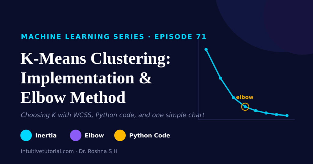
Now comes the fun part. Plot your WCSS scores against their matching K values.
At first, the curve drops sharply. Moving from K = 1 to K = 2, WCSS usually falls a lot. The same happens moving to K = 3. Each new cluster genuinely improves your grouping.
Then, something shifts. The curve begins to flatten. Extra clusters still lower WCSS, but only slightly. The line bends, almost like an elbow joint.
That bend gives the method its name. It marks the point where adding more clusters stops paying off. In most cases, the K sitting right at that bend becomes your best choice.
Consider a concrete example. Suppose your WCSS scores look like this across K = 1 through K = 8:
| K | WCSS |
|---|---|
| 1 | 920 |
| 2 | 540 |
| 3 | 305 |
| 4 | 150 |
| 5 | 118 |
| 6 | 96 |
| 7 | 80 |
| 8 | 68 |
Notice the pattern. Between K = 1 and K = 4, WCSS drops dramatically, from 920 all the way down to 150. However, after K = 4, the improvements shrink fast. Moving from K = 7 to K = 8 only saves 12 points.
That bend at K = 4 marks your elbow. Consequently, K = 4 becomes the recommended choice for this dataset.
No advanced statistics decided this for you. You simply read a chart, the same way you’d judge a shrinking suitcase return.
The Full Recipe, Step by Step
Let’s turn this into a clear, repeatable process. Four steps cover everything.
Step one: Choose a range of K values to test. K = 1 through K = 10 works well for most everyday datasets.
Step two: Fit a K-Means model for each K in that range. Every fit runs the familiar assign-and-update loop from Episode 70.
Step three: Record the WCSS score after each fit completes.
Step four: Once every K has a score, plot the results and locate the bend.
Steps two and three repeat once for every K value you chose. Step four only happens once, right at the end, after your list is complete.
Implementing the Elbow Method in Python
Theory only takes us so far. Let’s write real code.
Part 1: Collecting a WCSS Score for Every K
from sklearn.cluster import KMeans

wcss = []
for k in range(1, 11):
    model = KMeans(n_clusters=k, random_state=42)
    model.fit(X)
    wcss.append(model.inertia_)
Let’s walk through this line by line. First, we import KMeans from scikit-learn. Next, we create an empty list called wcss to store our results.
Then, we loop k from 1 to 10. Inside the loop, we build a new KMeans model using n_clusters=k. We fit that model on our dataset X. Finally, we append model.inertia_ to our wcss list.
That inertia_ attribute deserves special attention. Scikit-learn already calculates WCSS internally, so you never need to compute the sum of squared distances by hand. The library handles it for you automatically.
By the time this loop finishes, wcss holds one score for every K you tested. That list becomes the foundation for your elbow chart.
Part 2: Plotting the Curve and Reading the Bend
import matplotlib.pyplot as plt

plt.plot(range(1, 11), wcss, marker='o')
plt.xlabel('K')
plt.ylabel('WCSS')
plt.title('Elbow Method')
plt.show()
This second block turns your list of numbers into a picture. We import matplotlib.pyplot, then call plt.plot, passing our range of K values along the x-axis and our wcss list along the y-axis. The marker='o' argument adds a visible dot at each data point, which makes the bend easier to spot.
We label both axes, add a title, then call plt.show() to render the chart.
Five lines. That’s genuinely all it takes to turn raw numbers into a decision you can actually see. Remember, reading the elbow stays a visual judgment call. It never requires a separate formula. You’re simply applying the same instinct from packing a suitcase, now displayed on a chart.
The Catch: When the Elbow Isn’t Obvious
Not every dataset hands you a clean, sharp elbow. Sometimes the curve fades gradually instead. In those cases, two different people could reasonably choose two different values of K from the exact same chart.
Consider the elbow method a strong starting guess rather than a guaranteed answer. When your curve looks blurry, bring in a second opinion.
The Silhouette Score offers exactly that. Unlike WCSS, it measures how well-separated your clusters are, not just how tight they are internally. Combining both metrics often clears up ambiguous cases.
Additionally, don’t ignore your own knowledge of the data. If you already understand your customers, your products, or your domain, that context often breaks ties that a chart alone cannot resolve.
Why Choosing the Right K Actually Matters
At this point, you might wonder why any of this effort matters. Let’s connect the dots with real examples.
In customer segmentation, choosing too few clusters blends genuinely different customer types together. You lose the nuance that made segmentation valuable in the first place.
In image compression, K directly controls how many colors survive in your final image. Choose K poorly, and your compressed image either looks flat or barely compresses at all.
In topic grouping, picking too many clusters splits one coherent topic into several fake ones. Suddenly, your analysis becomes harder to interpret, not easier.
The same logic extends to market basket analysis, delivery hub placement, and recommendation systems. In every scenario, K shapes the groups you ultimately trust and act on. Get K right, and your insights become sharp. Get it wrong, and even a perfectly coded K-Means model produces misleading results.
Key Takeaways
Let’s bring everything together into a few core ideas.
WCSS, also called inertia, scores how tightly each K groups your data. It always drops as K increases, and that’s expected behavior, not a warning sign.
Plot WCSS against K, then look for the bend. That bend is your elbow, and it typically marks your best choice for K.
You don’t need an extra formula to find it. You simply need your eyes and a chart. When the elbow looks blurry, lean on the Silhouette Score for a second opinion, and trust your domain knowledge to settle close calls.
Most importantly, remember the suitcase. If you’ve ever stopped packing because one more item wasn’t worth the extra weight, you already understand the elbow method intuitively. Data science simply gave that instinct a name, a formula, and five lines of Python.
Common Questions About the Elbow Method
Before we wrap up, let’s address a few questions that often come up when learners apply this method for the first time.
Does the elbow method work for every dataset?
Not always. Some datasets produce a sharp, obvious bend. Others produce a smooth curve with no clear elbow at all. When that happens, don’t force a decision. Instead, combine WCSS with the Silhouette Score, or rely on your domain knowledge to guide the final call.
How many K values should I test?
For most everyday datasets, testing K = 1 through K = 10 works well. However, if your elbow sits right at the edge of that range, extend it further. A dataset with dozens of natural segments might need a wider range, such as K = 1 through K = 20.
Should I scale my features before running this process?
Yes, almost always. K-Means relies entirely on distance calculations. If one feature uses a much larger scale than another, it will silently dominate every distance calculation. Scale your features first, then run the elbow method for reliable results.
Can I automate elbow detection instead of reading the chart by eye?
You can. Libraries like kneed detect the bend programmatically, which helps when you’re running this process repeatedly inside a larger pipeline. Still, plotting the chart yourself at least once builds real intuition. That intuition helps you sanity-check any automated result later.
What Comes Next
K-Means asks you to commit to K before you even begin. That works well once you understand the elbow method. However, it isn’t the only way to cluster data.
In Episode 72, we explore Hierarchical Clustering. Instead of committing to K upfront, this approach builds a structure that reveals its own natural groupings as you go. You only decide on K at the very end, after seeing the full picture.
Watch the Full Video
This article summarizes Episode 71 of the Intelevo YouTube series. For the complete walkthrough, including a live demo of the elbow chart in action, watch the video embedded at the top of this page.
If this article or the video helped you, please like the video, subscribe to Intelevo, and drop a comment with your thoughts or questions. Every comment gets read.
You’ll also find this article’s link in the video description and pinned as the first comment, so feel free to bookmark it and return anytime you need a refresher.
Thank you for reading, and see you in Episode 72.