Gaussian distribution appears in various parts of science and engineering. Apart from a distribution often appear in nature, it has got important properties such as its relation to Central Limit Theorem (CLT).

The figure above shows one-dimensional Gaussian distributions of various mean and variance values.
Libraries like NumPy provide functions that can return Gaussian distribution values for given input values. This makes it easy to sample from such distributions of a given mean values and variance/covariance.
mu, sigma = 0, 0.1 # mean and standard deviation
x = np.random.normal(mu, sigma, 1000)
Here, apart from mean and variance the number 1000 represents the number of samples to be generated.
The equation of the single variable Gaussian distribution is shown below.
$P(d; \mu, \sigma) = \frac{1}{\sigma \sqrt{2 \cdot \pi}}e^{-\frac{(d – \mu)^2}{2 \sigma^2}}$
In the case of single variable Gaussian distribution, visualizing the curve is relatively easy due to its single dimension.
Some Geometrical Intuitions
Here we could try guessing shape of the distribution from the equation. If you don’t see it in the first place, let’s give it a try.
The ability to guess the shape of a function from its equation is a handy skill, especially in one-dimensional cases.
Let’s start with a simple function, $y = f(x) = C$. This means the value of $f(x)$ is a constant $C$ for all points of $x$. We can see this easily as horizontal line.

What if we add another constant 5 to $C$?. Then $y$ will become $C+5$
Here we can imagine every point being shifted 5 points upwards as number 5 was positive.

What about the function $y = mx$?. Here we can see that $y$ is proportional to $x$ and the proportionality is represented by the value of $m$. The higher the $m$, the steeper the line would be.

If $m$ was negative, the slope of the curve would have been in the downward direction (i.e. $y$ decreases as $x$ increases).
With the combination of the above two intuitions, you might recollect how we represented every line in the form of $y = mx+C$, which is known as slope-intercept from.
Essentially all the transformations possible can be broken down to a combination of the following basic transformations:
- Shifting vertically (up/down) (E.g. 2)
- Scaling (streaching or shrinking) vertically (E.g. 3)
- Shifting horizontally (left/right)
- Cascading
Here cascading means the output of one function is given to the input of another.

E. g. 4 Cascading of functions represented graphically
The above example explains what happens in function cascading with a visual example.
Here the red line represents $y =x$, green represents $y=x^2$, blue represents $y=x-1$.
In the case of blue graph, although it is a vertical shift operation as per the rule, due to its particular nature, it can also be interpreted/viewed as a horizontal shift operation.
The purple curve can be thought of as a mathematical operation after the vertical shift. Here we can see how the cascading of functions works.
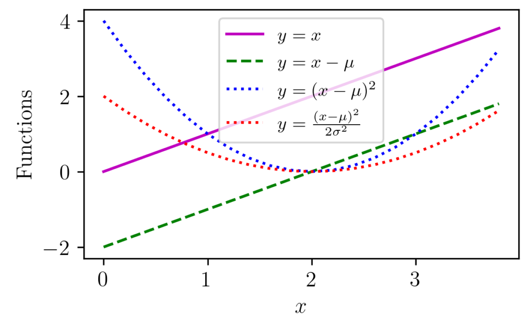
Back to the Gaussian Example
In the single-variable equation, you can see $\mu$ and $\sigma$ are constants. The term $\frac{1}{\sigma \sqrt{2 \cdot \pi}}$ is hence a constant or normalizing number which depends on the variance.
The exponent part ($e^{-\frac{(d – \mu)^2}{2 \sigma^2}}$) can be viewed as a cascading of functions.
The following figure shows how the transformations ($\mu$ = 2, $\sigma$ =1) can be decomposed visually.

As you can see here for each values of $x$, we can see the transformation happening at each stage of the process.
The red curve values are the one that goes to the negative exponent part and the constant scaling factor, $\frac{1}{\sigma \sqrt{2 \cdot \pi}}$ is ignored for the moment.
Now let’s see how the negative exponent curve in the range $(-2, 4)$ will look like.

If we try to trace $x$ from 0 to 4 in Figure 1 for few selected points, we can see how the red curve is starting from a higher value of 2 at $x=0$ to zero at $x=2$, and then again goes higher to nearby 2 at $x=4$.
If we plug in those output values from red curve (2–>0–>2) to the input of exponential decay and try to trace the graph we can relate how it resembles the Gaussian curve.
The final part would be to scale it with the constant value, $\frac{1}{\sigma \sqrt{2 \cdot \pi}}$, so that the total area under the curve is normalized to 1.
Once this is clear, it is easy to see the transformations.
Now we are ready to implement it in the form of a Python function.
Code
# import some non-ml libraries
import numpy as np
import matplotlib.pyplot as plt

# set values for clean data visualization
labelsize 	= 12
width 		= 4
height 		= width / 1.618

plt.rc('font', family ='serif')
plt.rc('text', usetex = True)
plt.rc('xtick', labelsize = labelsize)
plt.rc('ytick', labelsize = labelsize)
plt.rc('axes', labelsize = labelsize)

mu = 2
sigma = 1

def myGaussin1D(x,mu,sigma):
	const = 1/(sigma*np.sqrt(2*np.pi))
	expoPart = np.exp(-(((x-mu)**2)/(2*sigma**2)))
	return const*expoPart


fig1, ax 	= plt.subplots()
fig1.subplots_adjust(left=.16, bottom=.2, right=.99, top=.97)
x = np.arange(-2, 6, 0.2)
y0 = myGaussin1D(x, mu, sigma)

plt.plot(x,y0, color= 'k')
plt.xlabel('$x$')
plt.ylabel('Normal Distribution')

# save the graph
fig1.set_size_inches(width, height)
plt.savefig('normalDist1D.png', dpi = 300)
plt.close()
The resulting figure is shown below.

Concluding thoughts
We were able to see visually how the curve changes happen at each stage or cascading of functions. Visualizing functions to curves is often helpful in analyzing and understanding many concepts.
We were partly lucky to do this as the problem was one-dimensional. We will see later how the bivariate Gaussian distribution can be built on top of similar intuitions.