Here in this article, I explain how to do inset plotting using Python.
Inorder to do that, we will be using Python programming language and a famous plotting library named matplotlib. Let us start with a story to understand the requirement.
A use case scenario
Once upon a time, there was a scientist named Sarah. She was studying the behavior of a particular species of birds. She had collected a large amount of data on their feeding habits, mating rituals, and other behaviors. However, some of the more interesting patterns in the data were difficult to see on a regular plot. This was due to the scale of the axes.
One day, Sarah came across an article about inset plots and was intrigued. An inset plot is a smaller plot that is embedded within a larger plot. Inset plots are typically used to show a more detailed view of a particular section of the data. She thought this might be just what she needed to better understand the patterns in her bird behavior data.
Excited by the possibilities, Sarah set to work creating an inset plot of her own. She chose to focus on the feeding habits of the birds, which varied significantly based on the time of day. She created a larger plot of the overall feeding patterns over a 24-hour period. Then embedded a smaller plot within it that zoomed in on the specific feeding behaviors during a morning.
With her new inset plot, Sarah was able to see much more detail in the data. This helped her identify patterns that she had previously missed. The birds tended to feed more frequently during the morning hours, with a particular surge in activity around 9am. She also noticed that there was a lull in feeding activity around noon. This corresponded to the hottest part of the day.
Role of visualization in science
As scientists, we use plots and graphs to communicate our findings visually. Standard plots may not always be the most effective way to convey complex or nuanced data. Non-standard plots, on the other hand, can be more effective in certain situations. This can help us communicate our findings more accurately and efficiently.
For example, consider a situation where we are trying to show the non-linear relationship between two variables. A standard line graph may not accurately depict the relationship. But a non-standard plot such as a scatter plot with a smoothed curve or a contour plot can help us better visualize the relationship between the two variables.
Similarly, when dealing with data that is multivariate, standard plots may not be able to show all the relationships between the variables. In such cases, non-standard plots such as heatmaps or parallel coordinate plots can help us see the relationships between multiple variables in a single plot.
Non-standard plots can also be useful in cases where we want to emphasize certain aspects of the data or highlight particular features. For example, a mosaic plot or a treemap can be used to show the distribution of data within different categories or subgroups. Inset plotting is one such example which is used in some special sittuations.
Matplotlib library
Matplotlib is a Python library used for creating high-quality static, animated, and interactive visualizations in Python. With Matplotlib, you can create a wide range of plots, including line plots, scatter plots, bar plots, histograms, heatmaps, and many more.
But why is it so important? Well, visualizing data is crucial in data science and analytics. This is because it helps us understand patterns and relationships that may be hidden within the data. Matplotlib enables us to create visualizations quickly and easily so that we can analyze data more effectively.
One of the great things about Matplotlib is its flexibility. You can customize every aspect of your visualizations. These include the size and shape of the plot to the colors and labels used. Additionally, Matplotlib has a vast library of built-in styles and colors. This can help you create professional-looking plots with minimal effort.
Another benefit of using Matplotlib is that it integrates well with other Python libraries such as NumPy, Pandas, and Scikit-learn. This makes it easy to create visualizations from data stored in these libraries.
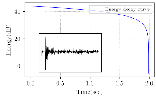
In many cases of data visualization, we need to make the best use of available space for plots. In my experience, each plot is unique in its own way. Hence with minimal improvements we can make it visually more pleasing. By doing so we will be able to convey more information using minimum space. Here I am plotting Energy Decay Curve of an audio signal (wav file) with its time domain view in inset.
Before proceeding further lets take a look at how the plot will look in the end.
Steps to generate inset plot
The first step would be to import the necessary libraries.
import numpy as np
import matplotlib.pyplot as plt
from scipy.io import wavfile
It is important to know the dimension or aspect ration of the image you want. I usually take the Golden ratio (1.61) as the aspect ratio. You need to decide the font size also according to the dimension. This ensures that the labels wont look too big or too small.
width = 3.5
height = width / 1.618
labelsize = 10
legendfont = 8
lwidth = 0.8
plt.rc('pdf', fonttype = 42)
plt.rc('font', family = 'serif')
plt.rc('text', usetex = True)
plt.rc('xtick', labelsize = labelsize)
plt.rc('ytick', labelsize = labelsize)
plt.rc('axes', labelsize = labelsize)
The following code generates the data to be plotted.
inputfile = 'IRTrimmed.wav'
Fs, x = wavfile.read(inputfile)
Fs = float(Fs)
rangetoplot = 2000
Lp = len(x)
Tp = np.arange(0, Lp / Fs, (1 / Fs)).T
Ppower = np.square(x)
PpowerRev = Ppower[::-1]
PEnergy = np.cumsum(PpowerRev)[::-1]
PEdB = 10 * np.log10(PEnergy)
Next, we create a figure object.
fig1, ax = plt.subplots()
fig1.subplots_adjust(left=0.16, bottom=0.2, right=0.99, top=0.97)
Now we can plot the main data and label the axes and legend.
plt.plot(Tp, PEdB, ls="solid", color="b", label="Energy decay curve", linewidth=lwidth)
plt.grid(True, which="both", linestyle=":", linewidth=0.6)
plt.xlabel("Time(sec)")
plt.ylabel("Energy(dB)")
plt.legend(loc="upper right", fontsize=legendfont)
Then we can create an inset inside our main plot and add a graph there.
ax2 = fig1.add_axes([0.25, 0.25, 0.4, 0.4])
ax2.plot(
    Tp[0:rangetoplot],
    x[0:rangetoplot],
    ls="solid",
    color="k",
    linewidth=0.5,
    label="RIR Time Domain",
)
ax2.set_xticks([])
ax2.set_yticks([])
Finally, we can save the plot to a dimension we want.
fig1.set_size_inches(width, height)
fig1.savefig("EnergyRIR.png", dpi=600)
By tweaking the default setting of plots it is possible to create publication-quality plots. Inset plotting can help save more space and convey more information. This is especially useful when it comes to journal publications where there is often a page limit.