This article explains the minmax scaling operation using visual examples.
Normalization of vectors, an array of values, signals is often used as a preprocessing step before many algorithms. For example, in machine learning, some types of algorithms are prone to different inherent scales of features. In such situations normalization is done to give the same weightage to all features before passing it to the algorithm for analysis.
It is possible to visualize the normalization process. Suppose we have data points 20, 15, 30 and 35.
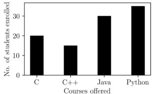
A first method to try to bring it down to a normalized scale would be to replace every data point with its ratio with the maximum value possible. In technical terms, we can write this as
$xnorm_i = \frac{x_i}{max(x)}$
Let’s visualize the result after the normalization with maximum value.
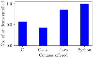
We can see this operation as shrinking down or transforming all points between 0 and 1. What if our data had negative points also?. To see this let’s make some modifications to our data so that it changes to -20, 15, 30, and 35.
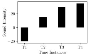
We can do the same normalizing operation as above here. This would result in the following figure.
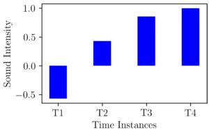
As we can see here the maximum value in our data was 35 and it is replaced with 1 and the lowest value of -20 is replaced with 0.57. Still we are in the range of -1 to +1 but What if we change our values to -200, 15, 30, 35 ?. Now our normalized graph will be like the one shown below.
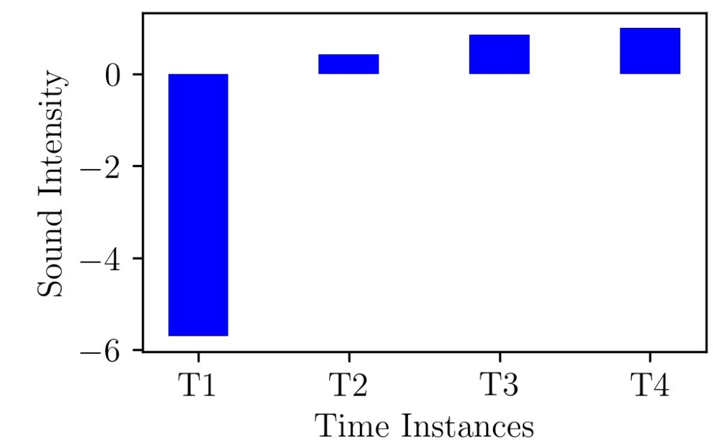
Here the number 200 is like an outlier and shifts the negative range to -6. Certainly not between -1 and +1.
Our exploration so far tells that it is not guaranteed to get the processed values in a certain range with our first method. This is because it depends on the data distribution, skewness, outliers, etc.
MinMax Scaling
As a second step towards a solution, the idea is to remove the average value from the data. If you are having an electrical engineering background, you might recognize this operation analogous to DC component removal.
It will make points above average as positive, on average as zero, and below-average as negative. If it were a non-skewed distribution of data, which makes it to have equal number and magnitude of data points on both positive and negative side.
As a final step, these values can be divided by the range of the given data points which makes it range between -1 to 1.
This can be represented in equation form as:
$xnorm_i = \frac{x_i – x_{mean}}{max(x)-min(x)}$
This is commonly known as min-max scaling. If you are a data scientist, you might know that the Scikit-learn library comes up with a built-in function for this process.
If we think about the process happening graphically we can see shifting vertically and then shrinking to unit size.
A Practical Example
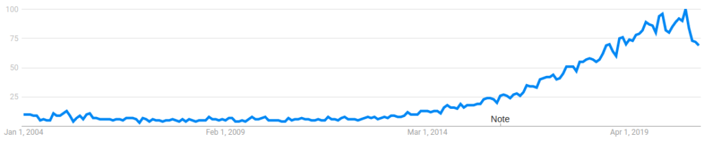
The following graph shows Google search trends for the keyword ‘data science’ from January 2004 to January 2021. Google trends give search popularity between 0 to 100. Zero corresponds to very low search popularity and 100 means very high popularity.
Can you imagine how this graph would look like after the min-max scaling?. Let’s take a look at how the original data and mean reduced data signal will look like.
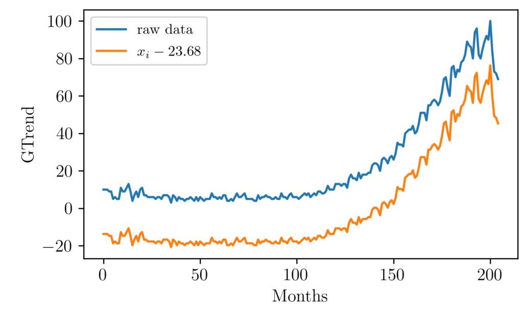
Here the mean value is around 23.68 because the search trends were low for nearly the first 125 months. Now let’s see how it will look like after we divide each data point with the range of values ($max(x)-min(x)$).
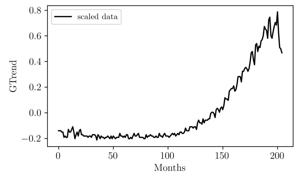
As we can see the shape of the graph is kept intact only the dependent variable range is changing and it lies between -1 and 1. The reason I have not put the black graph with the blue and orange is that their scale is so different and because of that we will not be able to see the changes in the black graph.
The important visual intuition I want to pass on to you is that the entire process is analogous to rescaling and positioning an image in photoshop. Here we specifically shifted a graph in the y-axis direction and then shrinked vertically so that it is brought between a range of -1 and 1.
The code for plotting these graphs is given below.
Code
# Import Libraries
import pandas as pd
import numpy as np
import matplotlib.pyplot as plt

# Set values for clean data visualization
labelsize 	= 12
width 		= 5
height 		= width / 1.618

plt.rc('font', family ='serif')
plt.rc('text', usetex = True)
plt.rc('xtick', labelsize = labelsize)
plt.rc('ytick', labelsize = labelsize)
plt.rc('axes', labelsize = labelsize)

fig1, ax 	= plt.subplots()
fig1.subplots_adjust(left=.16, bottom=.2, right=.99, top=.97)

# Load the data
data = pd.read_csv('dsGTrends.csv')

y = data['Trends'].values
x = np.arange(0,len(y))

# Do the min-max scaling
z = y-np.mean(y)
u = z/(np.max(y)-np.min(y))


# Plot the Graphs
# plt.plot(x,y, label = 'raw data')
# plt.plot(x,z, label = '$x_i-{}$'.format(np.round(np.mean(y),2)))
plt.plot(x,u,color='k', label = 'scaled data')
plt.xlabel('Months')
plt.ylabel('GTrend')
plt.legend()

# Save the graph
fig1.set_size_inches(width, height)
plt.savefig('minMaxScaling.jpeg', dpi = 300)
plt.show()
plt.close()
Minmax scaling is one of the simple scaling operation in machine learning. There is other scaling operation such as standardization which transforms every data point into a numerical value which represents how many standard deviations away is the point from the mean value.