The field of information theory defines entropy as a measure of average information a random variable takes. As we know the random variable is one whose possible outcome states are not deterministic. We cannot predict its behavior exactly in an analytical form. In such cases, we can only look at the patterns of its outcome to characterize its behavior for further analysis.
The measure entropy occurs frequently in science and engineering. In this post let us try to look at it from a visual perspective. As a very basic case let us take an example of a discrete random variable that has only two states. Hence its probability mass function will be a simplex with values $p$ for state 1 and $p-1$ for state 2.
Here $p$ could take any values between 0 and 1 hence for the other state it will be just $1-p$. The following two figures show two sample possible probability mass functions of our random variable. By looking at the figures can you guess which one is having more uncertainty?.
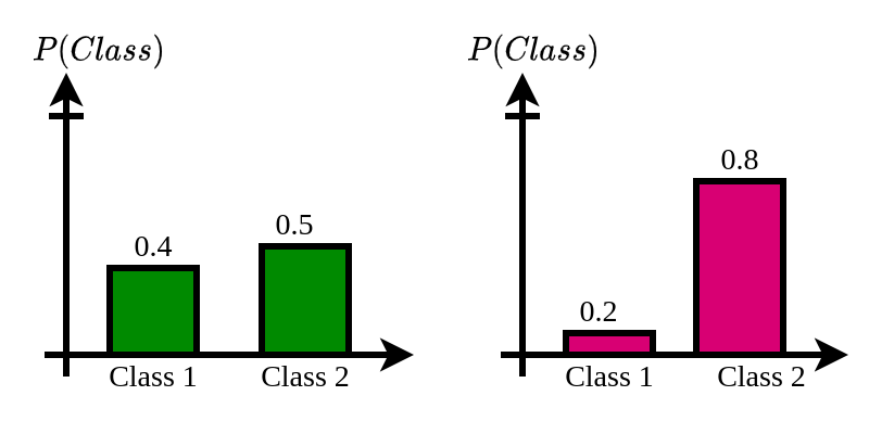
As you might have guessed, the first probability distribution has an almost equal probability of occurrence for both classes. But in the second graph, class 2 has a probability of 0.8 and class 1 is 0.2. Here the distribution is more imbalanced. However the high probability of class 2 in graph 2 makes it a more certain event.
Intuitively when the probability distribution is unimodal and more peaky, it is less uncertain on possible values it can take. On the other hand when it is more of flatter, the outcomes are more uncertain because the probability of occurance of all possible values are around the same.
Now the question is how to quantify this notion mathematically/programatically?. The entropy measure does that fairly well. The equation for entropy calculation from discrete probability mass functions is given below.
$H(X) = -\sum_{i=1}^{n}P(x_i)logP(x_i)$
Assuming a simplex distribution, let us see how the entropy value changes as we change the probability value for one class. The following code implements this equation and plots the $H(X)$ for various $x_i$ values ranging from 0 to 1.
import numpy as np
import matplotlib.pyplot as plt

labelsize   = 12
width       = 4
height      = 3

plt.rc('font', family ='serif')
plt.rc('text', usetex = True)
plt.rc('xtick', labelsize = labelsize)
plt.rc('ytick', labelsize = labelsize)
plt.rc('axes', labelsize = labelsize)

p1 = np.arange(0.01,0.99,0.01)
p2 = 1-p1

logP1 = np.log(p1)
logP2 = np.log(p2)

term1 = np.multiply(p1, logP1)
term2 = np.multiply(p2, logP2)

entropy = -(term1+term2)

fig, ax = plt.subplots()
fig.subplots_adjust(left=.15, bottom=.2, right=.97, top=.95)
plt.plot(p1, entropy)
plt.xlabel('$P_{class1}$')
plt.ylabel('Entropy')
# plt.show()

fig.set_size_inches(width, height)
fig.savefig('EntropyBinary.png', dpi=200)
plt.close()
The code will generate the following figure.
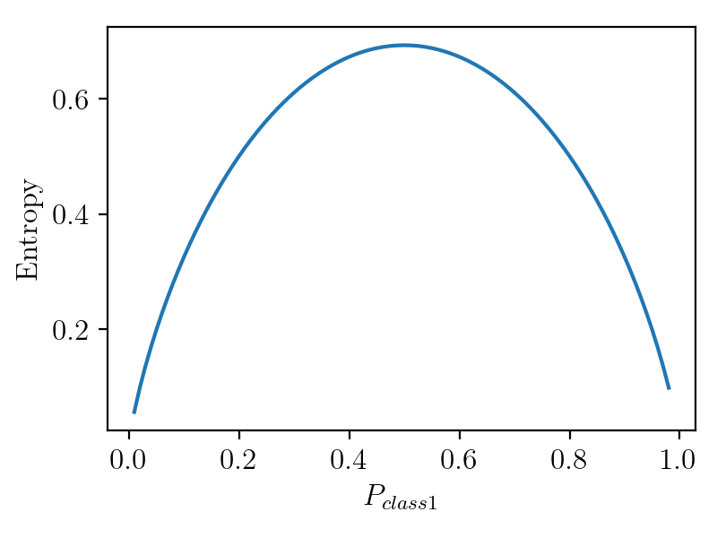
As we can see here the entropy is at its peak when the class probability is 0.5 and equal for both classes. For other probability distributions the entropy will be higher when the distribution is more like a uniform distribution.
Hopefully this article might have given you a visual intuition on entropy. If you want to see an application of this in machine learning please see the post on active learning where entropy is used to pick samples which needs to be labeled.