This tutorial walks you through building a breast cancer survivability prediction classifier which use clinical and gene expression data by employing machine learning techniques.
Overview
Cancer is a disease in which cells in the human body grow uncontrollably. This phenomenon often spreads to other parts of the body. Human bodies contain trillions of cells. Human growth starts with a one-celled zygote. Both sperm and egg from biological parents meet and form the zygote. The process of cell division is essential to human life to form various tissues and organs as the body needs them. The cells also have a life cycle. As they grow older or are damaged, the cells die and are replaced with new ones. This natural process sometimes breaks and abnormal or damaged cells keep multiplying. These unwanted cells may form tumors and can cause life threatening problems to a cancer patient. Such a situation is known as cancer.
Business Problem
Breast cancer is the second most common cancer after skin cancer in women. It affects nearly 2.1 million women every year globally. The modern way to approach and solve this problem is through Genetics. Genetic information is the software that runs behind every biological organism. Modern genetic measurement technologies such as Next Generation Sequencing and Microarray show light on active and inactive genes responsible for certain biological functions. Comparing these gene expression changes for healthy and cancerous cells sheds light on the causal factors associated with cancer growth. This gives better insights into cancer prognosis, administration of suitable drugs, and treatment plans such as therapy.
Business Constraints
The business constraints include the feasibility and availability of clinical and genomic data. Since the METABRIC dataset contains genomic data, when it comes to prediction of new input data, it will also have to go through genomic sequencing of tissue samples. This might be costly depending upon the country at which the patients live in. Another important constraint is, the results from model prediction have to be always verified by a qualified oncologist before making any medical recommendations. This is because the domain is dealing with healthcare of human beings, hence approvals from respective agencies (subject to countries) like Food and Drug Administration (FDA), ethical, data privacy considerations has to be taken care of when implementing it as a business solution.
Use of Machine Learning
In cancer research, the research community has accumulated a huge amount of data which is unstructured. Some of which include clinical data, drug data, DNA data, RNA data etc. It is required to make sense of this complex and unstructured data to bring insights out of it. Machine learning helps us to learn complex patterns from intricate data that are difficult for human beings to recognize manually. One such use case is estimating the overall survival of the patient and hence preventing unnecessary surgical treatments. Here in this project, the survival status is predicted using gene expression data and clinical data using classical machine learning algorithms so that better treatment and therapy plans can be suggested to a patient by the doctor.
Source of Data
The dataset going to be used in the case study is published in Nature Communications (Pereira et al., 2016), also available in Kaggle named as Molecular Taxonomy of Breast Cancer International Consortium (METABRIC) database. This is part of a Canada-UK Project which contains targeted sequencing data of 1,980 primary breast cancer samples. The associated clinical and genomic data was downloaded from cBioPortal. The dataset was originally collected by Professor Carlos Caldas from Cambridge Research Institute and Professor Sam Aparicio from the British Columbia Cancer Center in Canada.
Existing Approaches
Zhao, Melissa, et al. “Machine learning with k-means dimensional reduction for predicting survival outcomes in patients with breast cancer.” Cancer informatics 17 (2018): 1176935118810215.
URL: https://journals.sagepub.com/doi/full/10.1177/1176935118810215
In this research paper, the authors use clinical and genomic data available in the METABRIC database for breast cancer survival prediction. The primary objective is to construct predictive models for 5-year survival of patients with breast cancer. The machine learning models tried out include gradient boosting, random forest, SVM, and ANN. The performance of each model was evaluated using metrics such as ROC curve and accuracy. Out of all the models tried, no model significantly outperformed any other. ROC and accuracy was found out to be 0.67 – 0.72 across models. K-means clustering of gene expression profiles on training data points along with KNN classification of validation data points was employed. This found out to be a robust method for dimensionality reduction for gene expression data. As a secondary objective, important contributors to survival prediction were also identified by the authors.
Arya, Nikhilanand, and Sriparna Saha. “Multi-modal classification for human breast cancer prognosis prediction: proposal of deep-learning based stacked ensemble model.” IEEE/ACM transactions on computational biology and bioinformatics (2020).
In this paper, the authors proposed a deep learning based stacked Ensemble model for multi-mode classification of human breast cancer. The detection of short term survivability of cancer patients in the early stage is important because it will help to spare such patients from getting unnecessary treatment and medical expenses. This also helps to tailor treatment therapies specific to those patients so that better patient care can be provided. Previous studies have used unimodal data (e.g. gene expression).
A preprocessed version of the METABRIC dataset is used in this study. Here the authors leverage a multi-modal data which uses gene expression, copy number alteration, and clinical data. The modeling is carried out in two stages. In stage 1, a Convolutional Neural Network is used for feature extraction. In stage 2, a stack-based ensemble model is used for predicting the short term survivability. For the best model, they have reported an AUC score of 90.2%.
El-Bendary, Nashwa, and Nahla A. Belal. “A feature-fusion framework of clinical, genomics, and histopathological data for METABRIC breast cancer subtype classification.” Applied Soft Computing 91 (2020): 106238.
In this paper, the authors have tried out the concept of feature fusion to clinical, genomic and histopathological data for the classification of breast cancer subtype classification. Different machine learning models such as linear SVM, Radial SVM, Random Forests, Ensemble SVMs, and Boosting are tried out. The best performing model and data fusion found out was 88.6 % accuracy on linear SVM with features fused on clinical, gene expression, CNA and CNV. The Jaccard score for the respective model was 0.802 and Dice score of 0.8835. Hence the paper scientifically demonstrates that feature fusion from various METABRIC datasets improves the classification performance of breast cancer subtype classification.
My Improvements
Given the business value of the problem, more weightage has been given to Exploratory Data Analysis (EDA) to identify correlating features of the dataset associated with overall survival of the patient. Promising features shortlisted from EDA are then performed with Statistical T-test to identify causal role of that feature in overall survival of the patient. Machine learning models such as Logistic Regression, Decision Tree, Support Vector Machines, Random Forest, and XG Boost models are tried out and their performance is measured in terms of Sensitivity, Area Under the Curve (AUC), Accuracy, Specificity, and False Positive Rate.
Exploratory Data Analysis
The dataset is read and basic inspection is carried out. The following code snippet show that.
master_data = pd.read_csv('/kaggle/input/cancerdataset/METABRIC_RNA_Mutation.csv',low_memory=False)
nrows, ncols = master_data.shape

print('Number of Data points: ',nrows)
print('Number of Features: ',ncols)
Number of Data points: 1904
Number of Features: 693
master_data['death_from_cancer'].value_counts(normalize=True).sort_values().plot(kind = 'barh')

binary_counts = master_data['overall_survival'].value_counts()
print('Percentage of binary classes are: ', binary_counts*100/np.sum(binary_counts))
Percentage of binary classes are: 0—–> 57.930672, 1——-> 42.069328
Name: overall_survival, dtype: float64
The target label given was death_from_cancer but upon inspecting the features another feature named overall_survival was found to be a proxy to the given target label. Only one target variable death_from_cancer/overall_survival is to be used to prevent overfitting. The feature patient_id was removed as it doesn’t help in the exploratory data analysis or data modeling. If we group it across living as one class and dead as another class then both the target variables become a proxy of one another. The class distribution will be 57.93% (died) and 42.06% (survived).
Baseline Performance (57.9%)
A baseline classifier (a model which predicts all test points as the majority class) accuracy would be 57.9%. This has to be kept in mind when evaluating model classification performance and proposed models should have better accuracy scores.More than accuracy, we need to consider metrics like False Negatives as we are dealing with terminal disease.
Notes
- The dependent or predictor variable is death_from_cancer/overall_survival
- The predictor variable is given as a 3-class (Living, Died of Disease, Died of Other Causes) categorical variable
- Converting to binary variable: cancer_death 57%, survived 42%
- A baseline classifier (a baseline model which predicts all test points as the majority class) accuracy would be 57%
- More than accuracy, we need to consider metrics like False Negatives as we are dealng with terminal disease
- Patient id need to be eliminated
Check for missing values
fig, ax = plt.subplots( figsize = (15, 8))
sns.heatmap(master_data.isnull())
ax.set_title('Raw Dataframe')
plt.show()

A heatmap of missing values shows the missing values in the dataset. The respective percentage of missing values for each feature is printed out. Most of the features have less than 5% of missing values.
total = master_data.isnull().sum().sort_values(ascending = False)
percent = (master_data.isnull().sum() / master_data.isnull().count()).sort_values(ascending=False)
missing_data = pd.concat([total, percent], axis = 1, keys = ['Count_NaN', 'Percentage_Nan'])
missing_data.head(14)
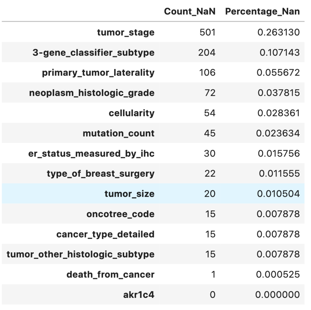
Notes
- 13 variables have missing values
- Only one target variable death_from_cancer/overall_survival is to be used to prevent overfitting
master_data = master_data.drop(['death_from_cancer'],axis=1)
Correlation Matrix
# Find correaltion between features
corrMat = master_data.corr().values
plt.hist(corrMat.flatten(),20)
plt.xlabel('Pearson correlation coefficient')
plt.ylabel('Count')
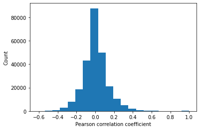
q1,q2 = np.percentile(corrMat.flatten(), [25 ,75])
print(q1,q2)
-0.0647 0.0650
fig, axs = plt.subplots(figsize = (15, 10))
sns.heatmap(master_data.corr())
plt.title('Correlation between all Features')
plt.show()
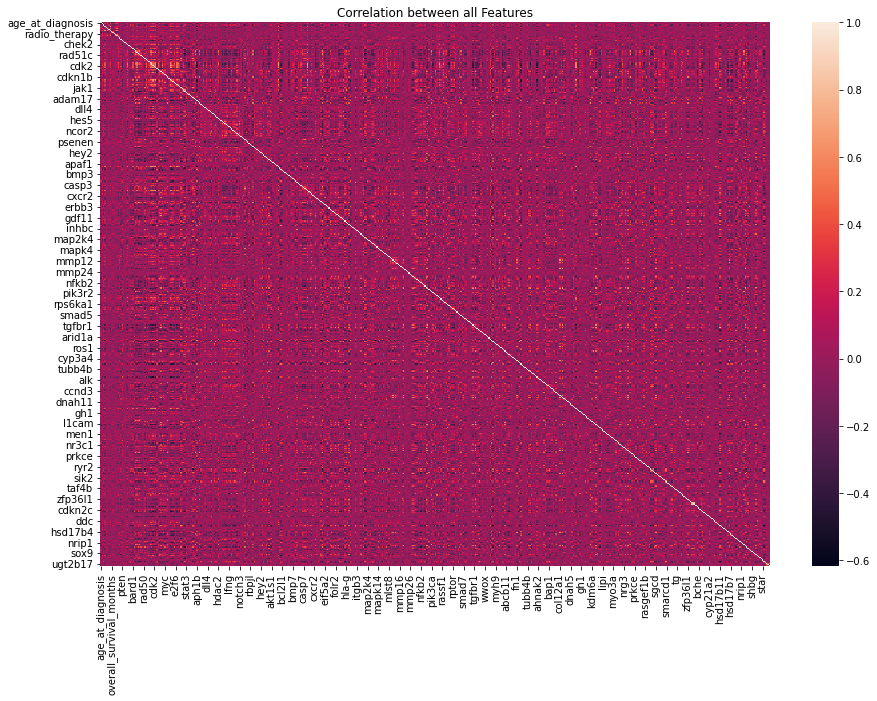
The Pearson correlation between every combination of attributes is measured. A heatmap showing the correlation between features is generated. The inter-quartile range of correlation values shows a moderate level of positive and negative correlation from -0.065 to 0.065. Features diversly correlated with the target variable are preferred.
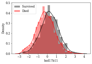
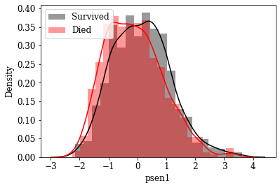
As a next step, to identify features which are better discriminative in terms of classifying a data point into either of the classes, each features density estimation is plotted and visualized amoung the groups.
Automate distplot & Investigate distplot of numerical features
def mydistplot1(variable, data):
    labelsize = 12
    plt.rc('font', family='serif')
    plt.rc('xtick', labelsize=labelsize)
    plt.rc('ytick', labelsize=labelsize)
    plt.rc('axes', labelsize=labelsize)

    (fig, axs) = plt.subplots(1, 1)
    plt.subplots_adjust(hspace=.3)
    class_1 = data[data['overall_survival'] == 1][variable]
    class_2 = data[data['overall_survival'] == 0][variable]
    sns.distplot(class_1, label='Survived', color='k', ax=axs, norm_hist=True)
    sns.distplot(class_2, label='Died', color='r', ax=axs, norm_hist=True)
    axs.set_xlabel(variable)
    axs.set_ylabel('Density')
    axs.legend(loc=2, prop={'size': 12})
    plt.savefig('./Graphs/'+'Density_'+variable+'.png',dpi=100)
    plt.close()
Notes
Numerical features where less overlap between density of survived and not survived class has been identified maually.
numericalFeats = master_data.select_dtypes('number').columns
categoricalFeats = master_data.select_dtypes('object').columns
 for variable in tqdm(numericalFeats):
     mydistplot1(variable,master_data)
Visualize Distributions of promising Features: By inspecting density plots manually the features whose density plot has less overlap for survived and died class were shortlisted. Some of the plots are given below.
Box plot view of few critical (based on anecdotal evidence) features
Features like Age, Tumor size, number of nodes which are likely to be a predictive attribute based on domain knowldge/anecdotal evidence were examined by plotting their box plot. There is a significant less overlap and variance difference between two classes in each of these features.
fig, ax = plt.subplots(ncols=3, figsize=(14,2), sharey=True)
color = 'Spectral'
two_colors = [ sns.color_palette(color)[0], sns.color_palette(color)[5]]

sns.boxplot(x='age_at_diagnosis', y='overall_survival', orient='h', data=master_data, ax=ax[0], palette = two_colors, saturation=0.90)
sns.boxplot(x='tumor_size', y='overall_survival', orient='h', data=master_data, ax=ax[1], palette = two_colors, saturation=0.90)
sns.boxplot(x='lymph_nodes_examined_positive', y='overall_survival', orient='h', data=master_data, ax=ax[2], palette = two_colors, saturation=0.90)

fig.suptitle('Box plot of Continuous Attributes', fontsize = 18)
plt.yticks([-0.5, 0, 1, 1.5], ['','Died', 'Survived',''])
ax[0].set_xlabel('Age in Year')
ax[0].set_ylabel('Survive (yes/no)')

ax[1].set_xlabel('Tumour diameter in (mm)')
ax[1].set_ylabel('')

ax[2].set_xlabel('Number of positive lymph nodes')
ax[2].set_ylabel('')

plt.show()

To scientifically backup the claims/statistically validate the arguement, statistical t-test were conducted and respective p values were computed.
Statistical T-Test of Important Features between Survived and Died Groups
T-Test Assumptions
- Independence: The observations in one sample are independent of the observations in the other sample.
- Normality: Both samples are approximately normally distributed.
- Homogeneity of Variances: Both samples have approximately the same variance.
- Random Sampling
statDF = pd.DataFrame()

for feature in promising_feats:
    group1 = master_data[master_data['overall_survival']==1]
    group2 = master_data[master_data['overall_survival']==0]
    tstats, p_value = stats.ttest_ind(group1[feature], group2[feature])
    statDF = statDF.append({'Feature': feature,\
                            't-statistics':tstats,\
                            'P_value': p_value}, ignore_index=True)
Statistically Significant Features Between Survived and Died Groups for an αα (significance value) of 0.001. The top features and their respective t-statistics and P-values are shown in the table below.
statDF['Significant'] = statDF['P_value']<0.001
statDF.sort_values('P_value')
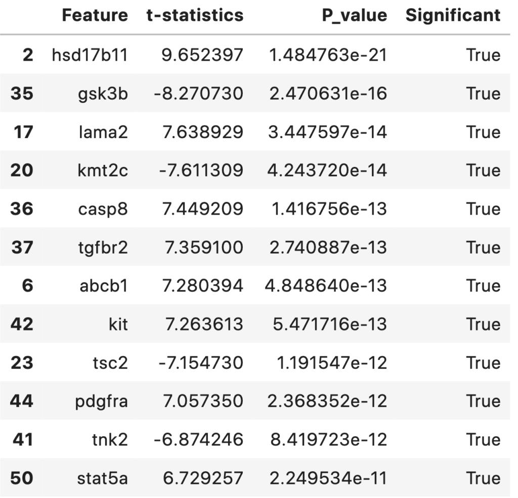
np.sum(statDF['Significant']==True)
39
A total of 39 statistically significant features (with an alpha level of 0.001) were foundout. They are sorted and listed out according to their p-value in ascending order. This table and features can be discussed with biologist/medical practitioners regarding its significance.
significantFeats = statDF[statDF['Significant']==True]['Feature'].tolist()
significantFeats = statDF[statDF['Significant']==True]['Feature'].tolist()
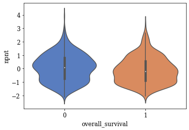
[‘foxo1’, ‘npnt’, ‘hsd17b11’, ‘prkd1’, ‘psen1’, ‘siah1’, ‘abcb1’, ‘pdgfb’, ‘mmp11’, ‘folr2’, ‘casp6’, ‘fgf1’, ‘hif1a’, ‘mlst8’, ‘e2f2′,’lama2’, ‘sf3b1’, ‘akt1’, ‘kmt2c’, ‘ccnb1’, ‘eif4e’, ‘tsc2’, ‘e2f7’, ‘tubb4b’, ‘mapk14’, ‘ar’, ‘ran’, ‘gsk3b’, ‘casp8’, ‘tgfbr2’, ‘aurka’, ‘tnk2’, ‘kit’, ‘pdgfra’, ‘syne1’, ‘ptk2’, ‘mmp7’, ‘stat5a’, ‘rps6’]
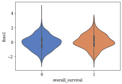
Violin Plots of Significant Features
The violin plot of these significant features are plotted. A few of the plots are shown below
def myviolinplot(feature, data):
    sns.violinplot(y=feature,\
                   x="overall_survival",\
                   data=data,\
                   palette="muted",\
                   split=True)
    plt.show()
for variable in tqdm(significantFeats):
    myviolinplot(variable,master_data)
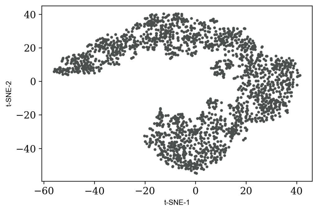
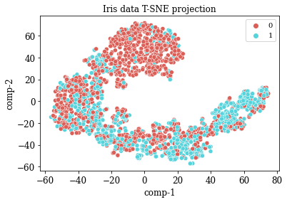
TSNE Visualization
numdata = master_data[numericalFeats]
numdata = numdata.fillna(numdata.mean())
tsne = TSNE(n_components=2, perplexity=20.0, n_iter=2000,verbose=1)
z = tsne.fit_transform(numdata)
df = pd.DataFrame()
df["y"] = numdata['overall_survival']
df["comp-1"] = z[:,0]
df["comp-2"] = z[:,1]

sns.scatterplot(x="comp-1", y="comp-2", hue=df.y.tolist(),
                palette=sns.color_palette("hls", 2),
                data=df).set(title="Iris data T-SNE projection")
Outlier Detection : Using Z-Score
Use simple dataframe describe to inspect outlier from mean and max values
# Compute Z-Scores
num_zscores = numdata.apply(zscore)

# Find all cells where zscore>3 or zscore<-3
num_zscores_binary = num_zscores.abs()>3

fig, axs = plt.subplots(figsize = (15, 10))
sns.heatmap(num_zscores_binary)
plt.title('Outlier data points across patients |z-score|>3')
plt.show()

Analysis to find efficacy of various types of therapies (Radiotherapy, Hormonal therapy, Chemotherapy)
1. Which treatment (Radiotherapy, Hormonal therapy, Chemotherapy) works best for breast cancer.
chemo = master_data[(master_data['chemotherapy']==1) & (master_data['hormone_therapy']==0) & (master_data['radio_therapy']==0)]
hormone = master_data[(master_data['chemotherapy']==0) & (master_data['hormone_therapy']==1) & (master_data['radio_therapy']==0)]
radio = master_data[(master_data['chemotherapy']==0) & (master_data['hormone_therapy']==0) & (master_data['radio_therapy']==1)]
c = chemo['overall_survival'].value_counts()
h = hormone['overall_survival'].value_counts()
r = radio['overall_survival'].value_counts()

print('Success rate of chemo:{} out of {} Trials'.format(c[1]/sum(c),sum(c)))
print('Success rate of hormone therapy:{}out of {} Trials'.format(h[1]/sum(h),sum(h)))
print('Success rate of radio therapy:{} out of {} Trials'.format(r[1]/sum(r),sum(r)))
Success rate of chemo:0.3778 out of 45 Trials
Success rate of hormone therapy:0.3334 out of 405 Trials
Success rate of radio therapy:0.5219 out of 228 Trials
2. Does a combination of therapy increases the chances of survival?
Success rate of chemo and hormone:0.3214 out of 28 Trials
Success rate of hormone and radio therapy:0.4317 out of 586 Trials
Success rate of chemo and radio therapy:0.4464 out of 168 Trials
Success rate of chemo, hormone, and radio therapy:0.5355 out of 155 Trials
The success rate of each treatment individually/combined is computed and along with their number of trials. Since the number of trials varies greatly across each treatment, it may be difficult to conclude which treatment works better. But in general combination of treatments seems to be popular/work better.
3. Does type of breast surgery has a role in survival as cancer mutations circulate in blood cells?
group1 = master_data[master_data['type_of_breast_surgery']=='MASTECTOMY']
group2 = master_data[master_data['type_of_breast_surgery']=='BREAST CONSERVING']
tstats, p_value = stats.ttest_ind(group1[feature], group2[feature])
print('P-Value',p_value)
print('Is significant: ', p_value<0.01)
P-Value 0.0168
Is significant: False
I have read that cancer appears again and the importance of liquid biopsy for early detection of reccuring of disease. Hence I framed my hypothesis that the type of breast surgery may not contribute to the survival of patient. The statistical significance test supports my arguement.
Notes
- Statistically significant features ($\alpha$<0.001) that desides the survival of patients has been identified using T-test
- Manually inspecting density of plots potential features that may help in classification are identified
- Potential 39 decisive features to do classification were quantified using T-test
- The statistically significant features points decisive genes in cancer expressed/suppressed by their mRNA levels. These can be discussed with biologist/medical practitioners
- Combination of therapies seems to have more success rate compared individual ones
Performance Metrics
Accuracy
The simplest evaluation metric for the classifier would be accuracy. If there are N number of predictions to be made and k of them found to be correct (including both positive and negative), the accuracy is the ratio between them. The accuracy can range from 0 to 1. The ideal value for accuracy is 1.
Accuracy = $\frac{k}{N}$
Confusion Matrix
Progressing from accuracy, the confusion matrix conveniently groups together the subgroup outcomes within a prediction. The problem under consideration is confined to a binary classifier. Under any circumstance, the classifier predicts a new input as positive/negative. The true class of the input could be positive/negative as well. This results in four possible combinations. A graphical representation of the same is shown in figure below.

The four components of the confusion matrix are True Positives (TP), True Negatives (TN), False Positive (FP), False Negative (FN). TP refers to the positive predictions where the data point was actually positive. Similarly, TN represents the negative predictions where the data point was actually negative. FP & FN is the cases when a negative datapoint is predicted as the positive and positive one predicted as negative.
Sensitivity
When it comes to critical classification tasks like medical tests, it is important to identify all positive cases even at the cost of FPs. Sensitivity also called True Positive Rate (TPR) is a metric capturing this information. It is the ratio between the number of positives identified by the classifier and the number of all the data points which are actually positive. The equation for sensitivity is given below. The ideal sensitivity value is 1.
$TPR = \frac{TP}{TP+FN}$
Specificity
Analogous to sensitivity, the metric specificity, also called True Negative Rate (TNR) is the ratio of the number of data points identified as negative to the total number of data points that are actually negative. The equation for specificity is given below. TNR ranges from 0 to 1 and the ideal value is 1.
$TNR = \frac{TN}{TN+FP}$
False Positive Rate (FPR)
The metric FPR, which is 1−TNR gives a measure about how likely the classifier is to misclassify a negative datapoint as positive. The equation for FPR is as follows.
$FPR = \frac{FP}{TN+FP}$
The ideal value for the FPR is 0. In general, it is desirable to have a low FPR, however, depending on the context and application this requirement could be relaxed. For example, when it comes to life-critical medical tests, the objective is to identify all subjects having the decease although there could be some FPs.
Reciever Operator Characteristic (ROC) Curve
There exists a trade-off among sensitivity or TPR and FPR for every binary classifier. A highly sensitive classifier/test may flag every positive case but may result in a lot of FPs and brings down the specificity. This is because depending on an internal threshold value for any classifier the sensitivity and FPR (1-specificity) of it changes. These dynamic changes are visually represented in a Receiver Operator Characteristic (ROC) curve. In ROC, the x-axis represents FPR (1-specificity) and the y-axis represents TPR (sensitivity).
A good classifier is expected to have high sensitivity and low FPR for every threshold value. An ideal ROC curve would be going from the lower left, covering upper-left as much as possible and ends at upper right. The Area Under the Curve (AUC) is a quantitative measure to capture how good one ROC curve is. The ideal value of AUC is 1. ROC curves are useful in comparing the performance (sensitivity and FPR) of different classifiers under different threshold values.
First-Cut Solution
The first-cut solution is it to try classifical machine learning algorithms in the preprocessed dataset. Models such as Logistic Regression, Decision Trees, Support Vector Machines, Random Forest, and XGBoost are tried out. The next step is to perform hyperparameter tuning and assessing cross-validated performance.
Model Explanation
Cross-validation
As machine learning models are subject to overfitting, cross-validation technique is employed in building the classifier. 5-fold cross-validation is performed for the dataset before calculating each performance metric. The conceptual representation of cross-validation is shown in Figure below.

Code
The code snippets corresponding to each part of EDA and modeling are shown as inline scripts in the article itself. A complete codebase containing data cleaning, EDA, modeling, and deployment has beed added to the GitHub repository.
Code of Best Performing Model
master_data = master_data.dropna()

def performanceResults(y_actual, y_hat):
    TP = 0
    FP = 0
    TN = 0
    FN = 0
    for i in range(len(y_hat)):
        if y_actual[i] == y_hat[i] == 1:
            TP += 1
        if y_hat[i] == 1 and y_actual[i] != y_hat[i]:
            FP += 1
        if y_actual[i] == y_hat[i] == 0:
            TN += 1
        if y_hat[i] == 0 and y_actual[i] != y_hat[i]:
            FN += 1
    acc = (TP + TN) / (TP + FP + TN + FN)
    sensitivity = TP / (TP + FN)
    specificity = TN / (TN + FP)
    fpr = FP / (FP + TN)

    print ('accuracy: ', acc)
    print ('sensitivity: ', sensitivity)
    print ('specificity: ', specificity)
    print ('fpr: ', fpr)
    return acc, sensitivity, specificity, fpr
labelsize = 12
plt.rc('font', family='serif')
plt.rc('xtick', labelsize=labelsize)
plt.rc('ytick', labelsize=labelsize)
plt.rc('axes', labelsize=labelsize)
y = master_data['overall_survival'].values
data = master_data.drop(['overall_survival'], axis=1)

numericalFeats = data.select_dtypes('number').columns
categoricalFeats = data.select_dtypes('object').columns

# Split Numeric and Categorical Tables
catdata = data[categoricalFeats]
numdata = data[numericalFeats]


# Scale Numerical Table
numdata_scaled = preprocessing.scale(numdata)

# One-hot Encode Categorical Table
encoder = OneHotEncoder(handle_unknown='ignore')
encoder.fit(catdata)
catendata = encoder.transform(catdata).toarray()

# Combine Features
X = np.concatenate((numdata_scaled, catendata), axis=1)

# Separate Train and Testing Data
(X_train, X_test, y_train, y_test) = train_test_split(X, y, test_size=0.30, random_state=42)
print('Working on XGBosst Model')
clf_XGB = XGBClassifier()
xgb_params = {'gamma': [0.5, 1], 'max_depth': [2, 3, 5, 8]}
clf_XGB = GridSearchCV(clf_XGB, xgb_params, cv = 10, scoring='roc_auc',refit = True)
clf_XGB.fit(X_train, y_train)
print(clf_XGB.best_params_)
dump(clf_XGB, './Pretrained/XGBoost.joblib')
Working on XGBosst Model
{‘gamma’: 0.5, ‘max_depth’: 3}
[‘./Pretrained/XGBoost.joblib’]
y_pred_XGB = clf_XGB.predict(X_test)
accuracy_XGB = metrics.accuracy_score(y_test, y_pred_XGB)

XGB_scores = cross_val_score(clf_XGB, X_train, y_train, cv=5)
print("'Cross-validated Accuracy XGB :' %0.4f (+/- %0.4f)" % (XGB_scores.mean(), XGB_scores.std()))
‘Cross-validated Accuracy XGB :’ 0.8128 (+/- 0.0212)
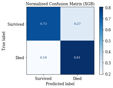
print('Performance Metrics of XGB')
PR_XGB = performanceResults(y_test, y_pred_XGB)
print(PR_XGB)
Performance Metrics of XGB
accuracy: 0.7621951219512195
sensitivity: 0.8057553956834532
specificity: 0.7301587301587301
fpr: 0.2698412698412698
(0.7621951219512195, 0.8057553956834532, 0.7301587301587301, 0.2698412698412698)
# Confusion Matrix: Save Matrix of selected group
np.set_printoptions(precision=2)
class_names = ['Survived', 'Died']

# Plot confusion matrix
titles_options = [('Confusion matrix, without normalization', None),
                  ('Normalized Confusion Matrix', 'true')]

path = './Metrics/'
def plotConfMats(clf,clf_name):
    for (title, normalize) in titles_options:
        disp = metrics.plot_confusion_matrix(clf,\
                                             X_test,\
                                             y_test,\
                                             display_labels=class_names,\
                                             cmap=plt.cm.Blues,\
                                             normalize=normalize)
        disp.ax_.set_title(title+' ({})'.format(clf_name))
        plt.savefig(path+'{}_'.format(clf_name) + title + '.png')
plotConfMats(clf_XGB,'XGB')

Comparison of Models

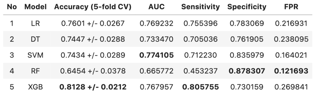
- The 5-fold cross-validated accuracy of XGBoost model is higher compared to other models and has more confidence.
- The models with highest AUC are SVM model followed by Logistic regression model
- The performance of all three models are above baseline (57.9% accuracy)
- XGBoost model has the highest sensitivity of 0.8057
- The AUC score difference between SVM model and XGBoost model are negligible
- Since the context here is to identify terminally ill patients and give them better treatment, the XGboost model can considered over SVM (despite SVM having highest AUC score) at the cost of False Positives.
Future Work
The future work will involve identifying causal features associated with overall survival of the patient.
Deployment
A web app is created using the Flask framework to serve the model online. The deploment code is also included in the GitHub. The online platfrom Heroku is used for deploying the web app. The web app can be accessed online at https://metabric.herokuapp.com/
Web app demo
A walk through of the deployed web app is shown in the demo video below
GitHub Repository
Please find the link to the GitHub repository here: https://github.com/cksajil/Breast-Cancer-Survival-Prediction
Connect with me on LinkedIn here: https://www.linkedin.com/in/sajilck/