In this article I will show you how to create common python plots using Python programming language and dummy data.
People from Science, Technology, Engineering and Medicine (STEM) fields often have to deal with scientific charts and graphs. They might use it to communicate their findings as well as learn the latest findings from their peers. Python plots can be used for this purpose.
Creating quality scientific plots is an important skill for the researchers in STEM fields. The most frequent scientific plots are a handful. Whether you are analyzing data, presenting results, or exploring complex relationships, having a solid understanding of these different plot types can help you better convey your findings.
Common Python Plots
Common python plots include line plot, bar graph, histogram, box plot, scatter plot, heatmap, images, and box plots. Let us learn how to create each of these plots using some dummy data.
Line Plot
Perhaps the most basic plot is line plot. The line plot, also known as a line graph, is a popular plot type used to show trends over one variable or across different categories.
The X-axis represents the independent variable, and the Y-axis represents the dependent variable. This plot type is particularly useful when you want to compare multiple datasets or trends in the same plot. Line plot can also be used to show the trend of more than one dependent variables with respect to one independent variable.
The following code shows how to plot a basic line plot using Python programming language.
# Import librarires
import numpy as np
from os import path
import matplotlib.pyplot as plt

def main():

    # Set plotting parameters
    labelsize = 12
    width = 5
    height = width / 1.618

    plt.rc("font", family="serif")
    plt.rc("xtick", labelsize=labelsize)
    plt.rc("ytick", labelsize=labelsize)
    plt.rc("axes", labelsize=labelsize)

    fig1, ax = plt.subplots()
    fig1.subplots_adjust(left=0.16, bottom=0.2, right=0.99, top=0.97)

    # Generate dummy data
    N = 10
    x = np.arange(N)
    y = x**3 + 2 * x + 2
    p1 = np.poly1d(np.polyfit(x, y, 1))
    p2 = np.poly1d(np.polyfit(x, y, 2))

    plt.plot(x, p1(x), color="k", label="line 1")
    plt.plot(x, p2(x), color="b", label="line 2", linestyle=":")
    plt.xlabel("x")
    plt.ylabel("y=f(x)")
    plt.legend()
    plt.show()

    # Save the graph
    fig1.set_size_inches(width, height)
    plt.savefig(path.join("graphs", "graph.jpeg"), dpi=150)
    plt.close()

if __name__ == "__main__":
    main()

If you are looking for a detailed tutorial on line plots which has two dependent variables in multiple axes, please see the post https://intuitivetutorial.com/2021/05/28/python-matplotlib-tip-overlapping-curves-and-multiple-axes/.
Bar plot
Bar plot is similar to line plot but it can be used to show the change of one or more discrete variables with respect to a common variable. This type of plot is useful for showing the relative size of different groups or comparing data across different groups.
The X-axis represents the categories, and the Y-axis represents the value of the data. The following code shows template code for a bar plot in python.
# Import librarires
import numpy as np
from os import path
import matplotlib.pyplot as plt

def main():

    # Set plotting parameters
    width = 5
    height = 3.5

    fig1, ax = plt.subplots()
    fig1.subplots_adjust(left=0.16, bottom=0.2, right=0.97, top=0.97)

    # Generate dummy data
    N = 10
    x = np.arange(N)
    y = x**2 + 2

    plt.bar(x, y, color="k")
    plt.xlabel("x")
    plt.ylabel("y")

    # Save the graph
    fig1.set_size_inches(width, height)
    plt.savefig(path.join("graphs", "graph.jpeg"), dpi=120)

if __name__ == "__main__":
    main()

Histogram
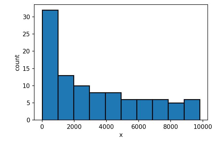
Histogram shows the distribution of a variable in terms of probability or count. The X-axis represents the range of data values, and the Y-axis represents the frequency or proportion of observations in each range.
Histograms are particularly useful for identifying patterns or trends in the data, such as whether the data is skewed or has outliers. We plot histogram and can choose the opacity of the histogram and adjust the linewidth of the edges using parameters in Python code below.
# Import librarires
import numpy as np
from os import path
import matplotlib.pyplot as plt

def main():

    # Set plotting parameters
    width = 5
    height = 3.5

    fig1, ax = plt.subplots()
    fig1.subplots_adjust(left=0.16, bottom=0.2, right=0.97, top=0.97)

    # Generate dummy data
    N = 100
    x = np.arange(N)
    y = x**2 + 2

    plt.hist(y, color="b", alpha=0.4)
    plt.hist(y, ec="k", lw=1.5)
    plt.xlabel("x")
    plt.ylabel("count")

    # Save the graph
    fig1.set_size_inches(width, height)
    plt.savefig(path.join("graphs", "graph.jpeg"), dpi=150)

if __name__ == "__main__":
    main()

Scatter plot
The scatter plot is a plot type that shows the trend between two variables. The X-axis represents one variable, and the Y-axis represents the other variable. Each data point is represented by a point on the plot, and the position of the point represents the value of the two variables.
Scatter plots are particularly useful for identifying patterns or relationships in the data, such as whether there is a linear or non-linear relationship between the two variables.
# Import librarires
import numpy as np
from os import path
import matplotlib.pyplot as plt

def main():

    # Set plotting parameters
    width = 5
    height = 3.5

    fig1, ax = plt.subplots()
    fig1.subplots_adjust(left=0.16, bottom=0.2, right=0.97, top=0.97)

    # Generate dummy data
    N = 20
    x = np.arange(N)
    y = x**2 + 2

    plt.scatter(x, y, color="k")
    plt.xlabel("x")
    plt.ylabel("f(x)")

    # Save the graph
    fig1.set_size_inches(width, height)
    plt.savefig(path.join("graphs", "graph.jpeg"), dpi=120)

if __name__ == "__main__":
    main()

Box plot
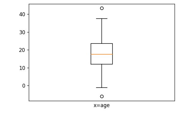
The box plot, also known as a box and whisker plot, is a plot type that shows the distribution of data and any outliers. The box represents the interquartile range (IQR), which is the range between the 25th and 75th percentile of the data.
The whiskers represent the range of the data, excluding any outliers. Outliers are represented as individual points on the plot. Box plots are particularly useful for identifying differences between groups or comparing the spread of the data.
# Import librarires
import numpy as np
from os import path
import matplotlib.pyplot as plt

def main():

    # Set plotting parameters
    width = 5
    height = 3.5

    fig1, ax = plt.subplots()
    fig1.subplots_adjust(left=0.16, bottom=0.2, right=0.97, top=0.97)

    # Generate dummy data
    y = np.random.normal(18, 10, 100)

    plt.boxplot(y)
    plt.xticks([])
    plt.xlabel("x=age")

    # Save the graph
    fig1.set_size_inches(width, height)
    plt.savefig(path.join("graphs", "graph.jpeg"), dpi=120)

if __name__ == "__main__":
    main()

Heatmap/image
The heat map is a plot type that shows the relationship between two categorical variables. The X-axis represents one categorical variable, and the Y-axis represents the other categorical variable.
Each cell in the plot is colored according to the value of the data, with different colors representing different values. Heat maps are particularly useful for identifying patterns or relationships in large datasets, such as whether there is a correlation between two categorical variables.
With the same concept, we can also show 2D matrix as an image. The code below shows how to display matrix data into a heatmap/image.
# Import librarires
import numpy as np
from os import path
import matplotlib.cm as cm
import matplotlib.pyplot as plt


def main():

    # Set plotting parameters
    width = 4
    height = 4

    fig1, ax = plt.subplots()
    fig1.subplots_adjust(left=0.05, bottom=0.05, right=0.95, top=0.95)

    # Generate dummy data
    data = np.eye(20, 20)
    ax.imshow(data, interpolation="bilinear", cmap=cm.Greys_r)
    plt.xticks([])
    plt.yticks([])

    # Save the graph
    fig1.set_size_inches(width, height)
    plt.savefig(path.join("graphs", "graph.jpeg"), dpi=100)


if __name__ == "__main__":
    main()

Violin Plot
The violin plot is a plot type that shows the distribution of data, similar to a box plot. Here it displays information about the median, quartiles, and range of a dataset. But it also provides additional information about the shape of the distribution.
A typical violin plot consists of a central “box” that represents the interquartile range (IQR) of the data. Here a thick line or bar in the middle indicating the median value. On either side of the box, there are “violin” shaped plots that represent the distribution of the data.
The width of the violin at any given point represents the density of the data at that value. The wider parts indicating areas of higher density and narrower parts indicating areas of lower density.
Violin plots are particularly useful for comparing the distributions of multiple groups side-by-side, as they can clearly show differences in shape, location, and spread. They are also useful for identifying outliers and extreme values in a dataset.
For violin plots we can use a specific visualization library in Python called seaborn.
# Import librarires
import numpy as np
from os import path
import matplotlib.pyplot as plt
import seaborn as sns

def main():

    # Set plotting parameters
    width = 5
    height = 3.5

    fig1, ax = plt.subplots()
    fig1.subplots_adjust(left=0.16, bottom=0.2, right=0.97, top=0.97)

    # Generate dummy data
    df = sns.load_dataset("titanic")
    sns.violinplot(x=df["age"])

    # Save the graph
    fig1.set_size_inches(width, height)
    plt.savefig(path.join("graphs", "graph.jpeg"), dpi=120)

if __name__ == "__main__":
    main()
