In STEM fields it is often required to communicate ideas using graphs or infographics. Many times the dimensionality of data will be higher and require clever hacks to represent so that the reader gets the idea quickly. There have been systematic studies on how to do data visualization effectively.
For data scientists or machine learning engineers, or anyone else from science and technology, one of the easy tools to create publication-quality plots is with Python programming language and its Matplotlib library.
Earlier we had covered how to do inset plotting and animating with Matplotlib graphs. In this plot, we will handle two scenarios, one is how to do plotting with multiple axes and the other is dealing with overlapping curves.
Let us take an example of plotting two curves in different ranges.
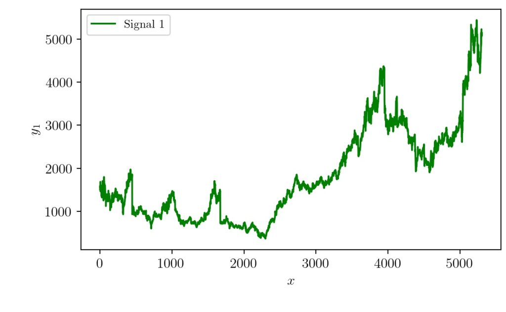
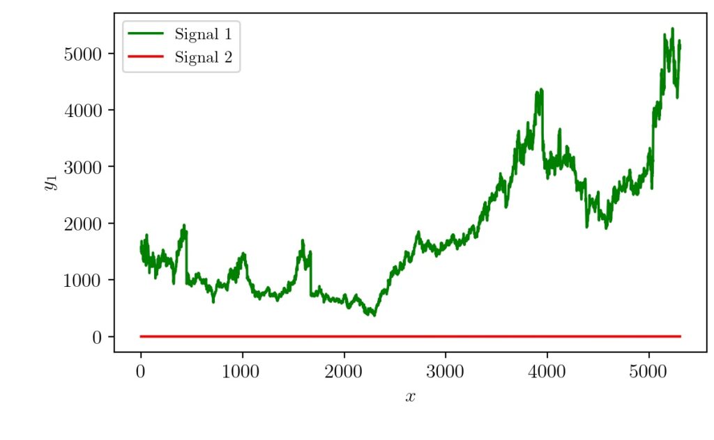
Here signal 1 is in the range of 500 to 5000. Signal 2 is that of similar same shape but in a different range from 0 to 1. If we try to plot both the graphs together the changes of signal 2 will be very small/invisible when compared to signal 1 as shown below. This means matplotlib sets the ylimit to that of the largest signal by default.
Plot In Different Scales
The solution for this problem is to add one additional axis so that we could plot two signals belonging to different maximum and minimum ranges but still compare them. Now let’s try that solution and see what we will get. Assuming we have the input and output signals as different variables, the minimum code snippet to do that is given below.
fig1, ax1 = plt.subplots()
ax2 = ax1.twinx()
ax1.plot(x, y1, label='Signal 1', c='g')
ax2.plot(x, y2, label='Signal 2', c='r')
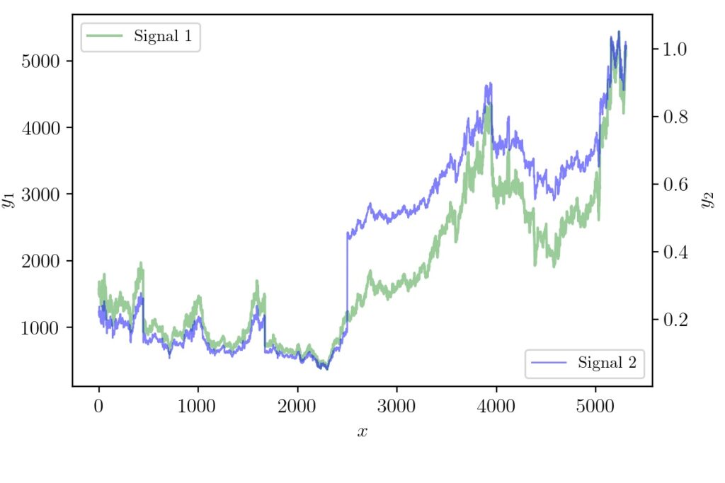
Now the figure will be modified as follows.

Plotting Overlapping Signals
The only problem now left is that the areas at which the colors overlap. The red curve almost masks the green one when it overlaps. It will be more problematic if the signals are the same at some region which will make the red completely mask/hide the green. The solution to making both visible in the overlapping areas can be done by adjusting linewidth, opacity, and good color combination. This can be done using python matplotlib overlapping graphs. The following code changes fixes the problem.
ax1.plot(x, y1, label='Signal 1', c='g', alpha=0.4,linewidth=1.5)
ax2.plot(x, y2, label='Signal 2', c='b', alpha=0.5,linewidth=1)
And the resulting graph will look like the one below.
Here we have given an attempt solve the problem of plotting signals of the different range which also overlaps on one another. With some tweaking and changes to default settings, a better plot is generated. The complete code to reproduce the results can be found here.
If you found this article helpful and would like to help me financially so that I can write more such content, you can do it via paypal.me/cksajil