Your model scores ninety-nine percent on training data. Then it fails in production. Sound familiar? This gap frustrates every machine learning practitioner at some point. Fortunately, one simple tool clears up the confusion instantly: the learning curve.
This article breaks down learning curves in machine learning using a single, intuitive analogy. You will learn to read three distinct patterns, understand the math behind them in plain English, and run real Python code that generates your own diagnostic plot. This is the companion article for Episode 59 of the Intelevo Machine Learning series. Watch the full video walkthrough on YouTube, and use this article to review the concepts at your own pace.
By the end, you will never again guess whether your model needs more data, a simpler design, or nothing at all. Let’s get started.
The Problem: Two Models, Zero Clarity
Picture two models sitting in a review meeting. Model A scores ninety-nine percent on training data but only sixty-one percent once deployed. Model B scores sixty-eight percent on training data and sixty-five percent in production.
Which model needs more data? Which one needs a simpler architecture? Without a diagnostic tool, every fix becomes a guess. Guessing wastes time, computing resources, and budget. Therefore, we need a better approach — one that shows the problem visually, instead of forcing us to speculate.
That approach is the learning curve.
Meet the Analogy: The Practice-Test Student
Every concept in this article maps back to one picture: a student preparing for an exam. This analogy keeps the math intuitive, so let’s set it up first.
Think of practice papers as the model’s training score. These are questions the student has already solved, answer key close by. In machine learning terms, this score reflects how well the model performs on data it has already seen during training.
Now think of the real exam as the model’s validation score. This is a fresh paper the student has never seen before. Similarly, in machine learning, this score reflects how well the model performs on new, unseen data — the number that actually matters once the model goes live.
Keep this analogy in mind. Every pattern we cover next builds directly on it.
What Exactly Is a Learning Curve?
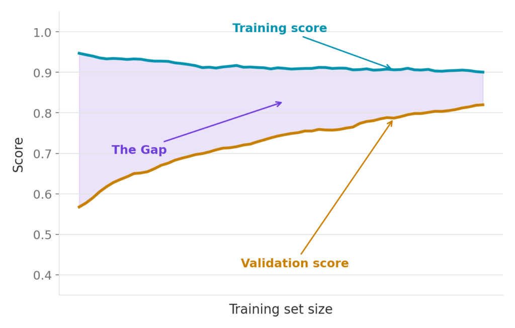
A learning curve plots two scores — training and validation — against the amount of training data the model has seen. Consequently, it shows you how your model’s performance evolves as it “studies” more examples.
On the x-axis, you have the number of training examples, similar to the number of practice papers the student has worked through. On the y-axis, you have the performance score: accuracy, F1, or whatever metric fits your problem.
Two lines appear on this plot. The first line represents the training score. The second line represents the validation score. The gap between these two lines carries the entire diagnostic story. Once you learn to read that gap, you can diagnose almost any model in seconds.
Pattern 1: High Bias, or Underfitting
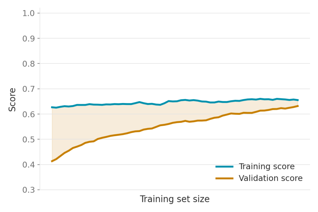
Picture a student who solves practice paper after practice paper but never truly grasps the underlying concepts. More practice does not help this student. As a result, the score stays low on both the practice papers and the real exam.
In a learning curve, this pattern shows up as two lines that sit close together, but both remain at a low score. The model has not learned enough from the data, regardless of how much data you feed it.
The rule: low score plus a small gap equals underfitting. Your model is too simple for the problem at hand.
This matters because many beginners assume more data automatically fixes every issue. However, underfitting rarely improves with additional data alone. Instead, you need a smarter approach, which we cover in the fixes section below.
Pattern 2: High Variance, or Overfitting
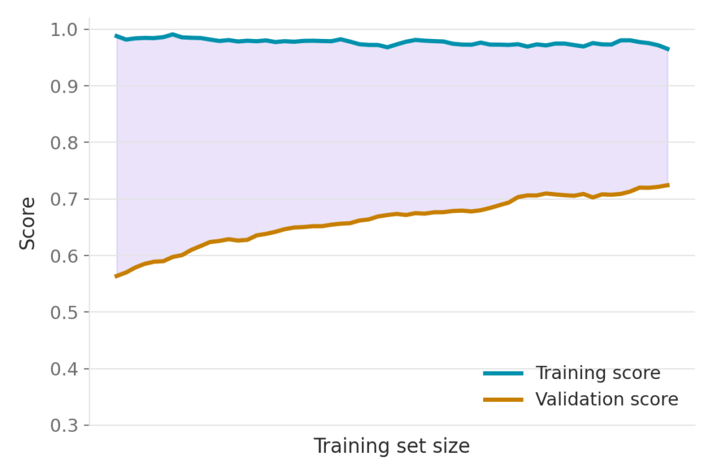
Now picture a different student — one who memorizes the exact practice papers, every question and every answer, word for word. This student scores nearly perfectly on the practice papers. But the real exam contains different questions, so the score drops sharply.
In a learning curve, this pattern shows a training line sitting high near the top, while the validation line stays well below it. Crucially, that gap does not close, even as training data increases.
The rule: a high training score plus a big, persistent gap equals overfitting. Your model has memorized the training data instead of learning patterns that generalize to new data.
Overfitting often surprises newcomers because the training metrics look fantastic. Nevertheless, those numbers hide a serious problem that only becomes visible once you check the validation score.
Pattern 3: The Sweet Spot, or Good Fit
Finally, picture the student who actually understood the subject. Practice score and real exam score both land high, and they sit close together. This closeness proves that the learning generalizes — the student is not just memorizing, but genuinely understanding the material.
In a learning curve, this pattern shows both lines converging near the top, with a small and shrinking gap. When you see a high score alongside a small, closing gap, you have found your green light to ship the model.
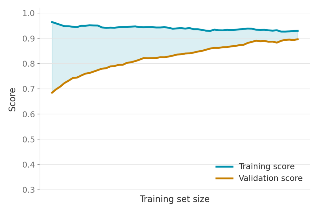
Together, these three patterns cover nearly every diagnostic situation you will encounter. Once you recognize their shapes, you can glance at any learning curve and know instantly what is happening.
Comparing All Three Patterns Side by Side
Placing all three patterns next to each other makes the differences obvious. The axes stay identical across all three plots. Only the shape of the gap changes.
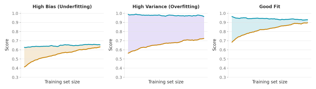
- Low and close together signals underfitting.
- High training score with a wide, persistent gap signals overfitting.
- High and close together signals a good fit.
This side-by-side comparison forms the core diagnostic skill covered in this article. Once internalized, you will apply it instinctively to every model you train from now on.
From Diagnosis to Action: What Do You Actually Change?
Diagnosing the problem solves only half the puzzle. Next, you need to know exactly what to change.
Fixing High Bias (Underfitting)
If your learning curve shows underfitting, consider the following adjustments:
- Increase model complexity.
- Add more informative features.
- Reduce your regularization strength.
- Try a more powerful algorithm altogether.
Interestingly, simply throwing more data at a high-bias model rarely helps on its own. The model’s structure, not the data volume, causes the low score. Therefore, structural changes matter more here than dataset size.
Fixing High Variance (Overfitting)
If your learning curve shows overfitting, consider these adjustments instead:
- Gather more training data.
- Simplify the model or trim down features.
- Increase your regularization strength.
- Use cross-validation and early stopping.
- Try ensembling methods, such as bagging.
Notice how the fixes for bias and variance move in nearly opposite directions. This is precisely why diagnosis must come before action. Applying a variance fix to a bias problem, or vice versa, wastes effort and can even worsen performance.
The One Formula Worth Remembering
This article promised minimal math, and it delivers on that promise. Here is the single idea worth remembering:
Total Error ≈ Bias² + Variance + Irreducible Noise
Bias-heavy models behave simply and stubbornly — they underfit. Variance-heavy models behave flexibly and erratically — they overfit. A learning curve simply gives you a window into this trade-off, made visual and easy to read.
You do not need to memorize a derivation. Instead, remember the intuition: every model balances between being too rigid and too flexible, and the learning curve shows you exactly where your model currently sits.
Seeing It in Code: A Real Python Example
Theory becomes far more useful once you see it in action. Below is a working example using scikit-learn’s learning_curve function, applied to the digits dataset with a support vector classifier.
from sklearn.model_selection import learning_curve
from sklearn.svm import SVC
from sklearn.datasets import load_digits
import numpy as np

X, y = load_digits(return_X_y=True)
model = SVC(kernel="rbf", gamma=0.001)

sizes, train_sc, val_sc = learning_curve(
    model, X, y,
    cv=5, train_sizes=np.linspace(0.1, 1.0, 8)
)

train_mean = train_sc.mean(axis=1)
val_mean   = val_sc.mean(axis=1)
Let’s walk through this step by step. First, the code imports learning_curve from sklearn.model_selection and SVC from sklearn.svm. Next, it loads the digits dataset, a classic collection of handwritten digit images.
Then, the code calls learning_curve, passing in the model along with the features X and labels y. Notice the cv=5 parameter. This means five-fold cross-validation, so every score gets averaged across five different splits rather than relying on a single, potentially lucky or unlucky split. The train_sizes parameter tells the function to test eight different training-set sizes, ranging from ten percent of the data up to the full one hundred percent.
This function returns three arrays: the sizes tested, the training scores, and the validation scores. Each array contains one row per size and one column per fold. Consequently, the code averages across the fold axis, axis=1, producing a single training-score line and a single validation-score line, exactly what gets plotted.
On this particular run, the final training score reached 0.999, while the validation score reached 0.972. That is a tiny gap sitting at a high score. In other words, this is a textbook good fit, straight from Pattern 3 above.
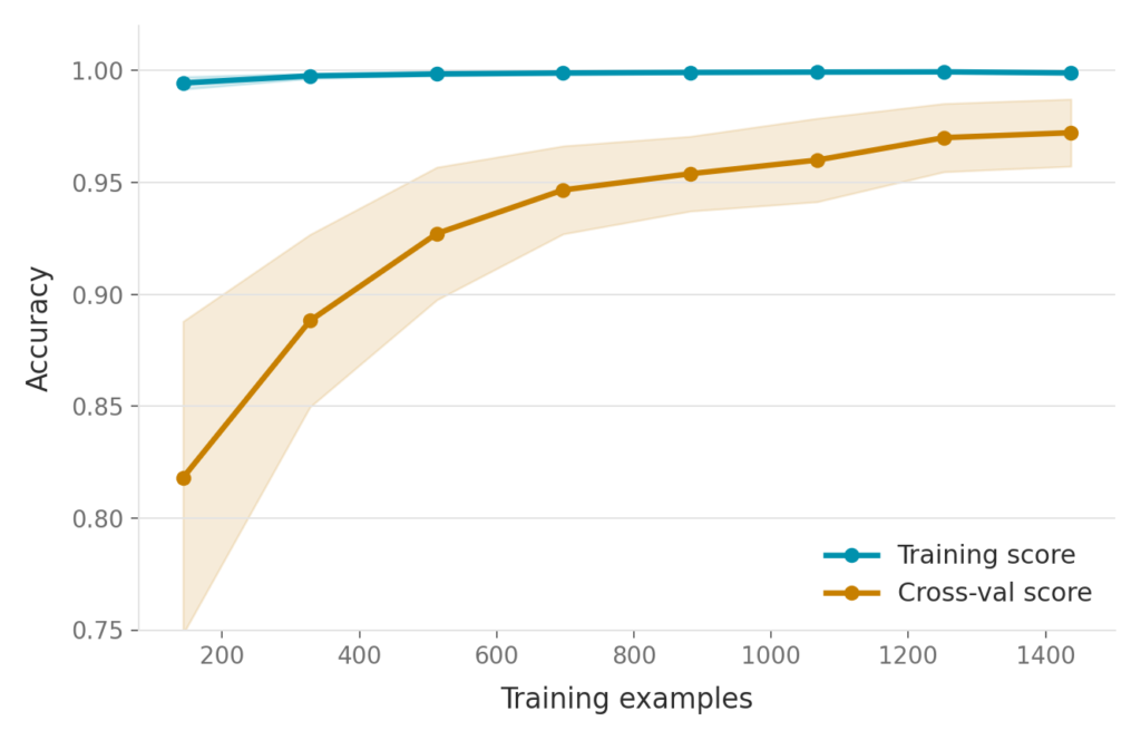
This hands-on example proves that diagnosing your model takes only a few lines of code. Once you run this on your own dataset, you gain immediate, visual insight into whether your model needs more data, a structural change, or nothing at all.
Common Pitfalls to Avoid
Even experienced practitioners stumble over a few recurring mistakes when reading learning curves. Watch out for these:
Skipping cross-validation. A single train-test split introduces noise into your results. Always average scores across multiple folds for a reliable picture.
Ignoring the y-axis scale. A gap that looks dramatic visually might represent only a one or two percent difference in actual accuracy. Always check the numbers, not just the shape of the plot.
Plotting too few training sizes. Use at least five or six points along the x-axis. Otherwise, the curve’s shape becomes little more than a guess.
Expecting more data to fix bias. More data narrows variance gaps effectively. However, it rarely cures underfitting on its own. Structural changes remain necessary in that case.
Avoiding these pitfalls ensures your diagnosis stays accurate, which in turn saves significant debugging time down the line.
Recap: Three Lines Tell the Whole Story
Let’s bring everything together. A learning curve plots training score against validation score as your training data grows.
A low score with a small gap signals underfitting. Add complexity, or reduce regularization, to fix it. A high training score with a big, persistent gap signals overfitting. Add data, or regularize more, to fix it. A high score with a small, closing gap signals a good fit — your clear signal to ship.
This simple framework applies across nearly every supervised learning algorithm, from linear regression to deep neural networks. Once you master it, you gain a diagnostic superpower that saves hours of blind experimentation.
Where Learning Curves Fit Into Your Broader Workflow
Learning curves work best as an early diagnostic step, not a one-time check. Ideally, you should generate a learning curve right after training your first baseline model, before you invest time in hyperparameter tuning. Otherwise, you risk tuning a model whose real problem is structural, not parametric , a mistake that wastes both time and compute.
Once your learning curve confirms a good fit, other diagnostic tools become more useful. For instance, Episode 58 of this series covered ROC curves, AUC, and threshold tuning. Those tools help you fine-tune decision boundaries once you already trust your model’s underlying fit. In other words, learning curves answer “is my model fundamentally sound?” while ROC curves answer “how should my model make decisions?” Both questions matter, but they matter in a specific order.
Similarly, confusion matrices and precision-recall curves work best after you rule out underfitting and overfitting. Running these tools too early can mislead you, because a fundamentally broken model will produce confusing metrics no matter how you slice them. Therefore, always start with a learning curve, and only move forward once the diagnosis looks healthy.
This workflow also scales well to larger projects. If you manage several models across a project — say, a baseline, a tuned version, and a final ensemble — plot a learning curve for each one. Comparing these plots side by side often reveals which changes actually helped and which changes only shifted the problem elsewhere. As a result, you build a much stronger intuition for how your specific dataset behaves under different model choices.
Finally, keep in mind that learning curves adapt easily to any metric, not just accuracy. Swap in F1 score, precision, recall, or a custom scoring function, and the same three patterns still apply. This flexibility makes learning curves one of the few diagnostic tools that work identically across classification, regression, and even some ranking problems.
What’s Next: Building ML Pipelines
Coming up in Episode 60, we shift focus to building ML pipelines using Pipeline and ColumnTransformer. This next lesson chains preprocessing and modeling into one clean, leak-proof step. As a result, every score you compute, including the learning curves covered in this article, becomes trustworthy by construction.
Final Thoughts
Learning curves in machine learning remove the guesswork from model diagnosis. Instead of wondering whether your model needs more data or a simpler design, you can glance at one plot and know immediately. The practice-test student analogy makes the concept stick, the three patterns give you a repeatable diagnostic framework, and the Python example shows exactly how to generate your own curve in minutes.
Watch the full video walkthrough on the Intelevo YouTube channel for a slide-by-slide explanation with additional visuals. If this article helped clarify learning curves in machine learning, share your thoughts in the comments below, and subscribe for the rest of the Machine Learning series. See you in Episode 60.