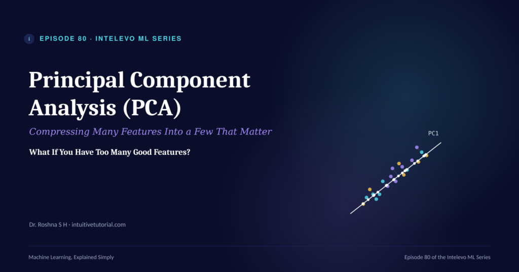
You collected forty features for your model. Then you added ten more. Now your dataset feels bloated, and half those columns just repeat what the others already say. This is exactly where Principal Component Analysis earns its place in your toolkit.
This article is the companion piece to Episode 80 of the Intelevo Machine Learning series. Watch the full video walkthrough above, or read on for the complete breakdown, the code, and the intuition behind it. Either way, by the end, Principal Component Analysis will feel refreshingly simple.
What Is Principal Component Analysis?
Principal Component Analysis, or PCA, compresses many features into a smaller set of new features. Each new feature is called a principal component. Together, these components still capture almost all the original information.
Here’s the key shift in thinking. In Episode 79, we covered feature selection. That process keeps or drops columns exactly as they are. Nothing about the columns themselves changes. Principal Component Analysis works differently. It builds brand-new columns from combinations of the old ones. As a result, you end up with fewer columns, yet you lose very little signal.
So, why does this matter? Imagine a housing dataset with six columns: square footage, bedrooms, bathrooms, garage size, lot size, and age. Notice that square footage, bedrooms, and bathrooms usually rise together. Bigger houses tend to have more of everything. That shared movement is redundancy, and Principal Component Analysis exists specifically to compress it.
The Big Idea: PCA Is a Camera Finding Its Best Angle
Let’s build intuition first, because intuition makes everything downstream easier to follow.
Picture a photographer holding a camera in front of a 3D object. From a random angle, the object looks flat and confusing. But rotate the camera slowly, and eventually you find the one angle where the object looks biggest and most spread out. That single photograph now tells you almost everything about the object’s shape.
Principal Component Analysis does the same thing with your data. Each raw feature acts like one “view” of the dataset. Many of these views overlap, since they repeat information that other features already show. So, PCA rotates the axes mathematically until it finds the direction where the data spreads out the most. Then, it keeps only the clearest few “shots,” which we call components.
Consequently, PCA doesn’t delete your original features. Instead, it finds new camera angles built from all of them combined.
In Plain Words: One Sentence Covers It All
Here’s the entire idea in a single sentence: Principal Component Analysis finds new directions in your data, ranks them by how much they capture, and keeps only the top few.
Let’s break that down into three moves:
- Combines. PCA blends correlated features into new, uncorrelated ones.
- Ranks. It orders these new directions by how much of the data’s spread, or variance, each one captures.
- Keeps. Finally, it retains only the top few components and drops the rest, with minimal loss.
That’s genuinely the whole mental model. Everything else in this article simply adds detail to these three steps.
The Four-Stage PCA Pipeline
Every application of Principal Component Analysis follows the same shape. Once you internalize these four stages, you can apply PCA to any dataset with confidence.
1. Standardize. First, put every column on the same scale. Otherwise, a feature measured in the thousands will dominate the process purely because of its size, not its actual importance.
2. Find directions. Next, compute the directions, or components, along which the data spreads out the most.
3. Rank and choose. Then, order these components by how much variance they capture, and decide how many you actually need.
4. Transform. Finally, project your original data onto the chosen components. The result: fewer columns, but the same underlying signal.
Now, let’s see these four stages in action using Python.
PCA in Python: A Complete Walkthrough
We’ll use the same housing dataset mentioned earlier: square footage, bedrooms, bathrooms, garage size, lot size, and age.
Step 1: Standardize the Data
from sklearn.preprocessing import StandardScaler

features = ["Sqft", "Bedrooms", "Bathrooms",
            "Garage_Sqft", "Lot_Sqft", "Age"]

X = df[features]
X_scaled = StandardScaler().fit_transform(X)
Square footage is measured in the thousands, while age is measured in decades. Since Principal Component Analysis is sensitive to scale, these units need to match first. StandardScaler centers every column at zero, with a standard deviation of one. Skip this step, and PCA will wrongly treat the largest-magnitude column as the most important one.
Step 2: Fit PCA and Inspect the Variance
from sklearn.decomposition import PCA

pca = PCA()
pca.fit(X_scaled)

print(pca.explained_variance_ratio_)
# array([0.52, 0.21, 0.13, 0.08, 0.04, 0.02])
Calling PCA() with no arguments computes one component for every original feature, ranked by importance. The output, explained_variance_ratio_, tells you what fraction of the total spread each component captures. Notice that the first component alone captures fifty-two percent of everything. That’s the redundancy Principal Component Analysis is exploiting.
Step 3: Decide How Many Components to Keep
import numpy as np

cumulative = np.cumsum(pca.explained_variance_ratio_)
n_components = np.argmax(cumulative >= 0.95) + 1

pca_95 = PCA(n_components=0.95)
X_reduced = pca_95.fit_transform(X_scaled)
Here, cumsum() adds up the variance captured as you include more components, one at a time. Then, argmax finds the smallest number of components needed to cross ninety-five percent. Alternatively, you can skip the manual math entirely. Just pass n_components=0.95 directly into PCA, and scikit-learn keeps exactly that much variance for you.
Step 4: Transform and Visualize
import matplotlib.pyplot as plt

pca_2d = PCA(n_components=2)
X_2d = pca_2d.fit_transform(X_scaled)

plt.scatter(X_2d[:, 0], X_2d[:, 1],
            c=df["Price"], cmap="viridis")
plt.xlabel("PC1")
plt.ylabel("PC2")
At this point, six correlated columns become two. That’s small enough to plot on a single chart. Each point represents one house, and points sitting close together shared similar values across all six original columns. When you color the points by price, the pattern often lines up closely with the first component, PC1, which is the direction of biggest spread.
Eigenvalues and Explained Variance, Without the Jargon
Every principal component boils down to two numbers, and understanding them makes the rest of Principal Component Analysis click into place.
First, there’s the principal component itself. This is a direction, expressed as a specific blend of your original features. For example, it might look like 0.6 × Sqft + 0.5 × Bedrooms, plus smaller contributions from the rest.
Second, there’s the eigenvalue. This number tells you how much spread, or variance, lies along that direction. A bigger eigenvalue means a more informative component.
From the eigenvalue, you get the explained variance ratio:
EVR = λᵢ / Σλ
In plain terms, this ratio is simply the share of total variance that one component holds. Add these ratios together across your chosen components, and you’ll know exactly how much of the original information you kept.
So, here’s the practical rule: rank components by eigenvalue, and keep adding them until the ratios sum to whatever target you need. Most practitioners aim for ninety to ninety-five percent.
Why Principal Component Analysis Matters
At this point, you might wonder whether the extra step is worth it. It is, and here’s why.
Faster training. Fewer columns mean less computation for every model that follows. Consequently, your training loop runs faster, and your infrastructure costs less.
Removes redundancy. Once you compress your features, correlated columns stop fighting each other inside the model. Each component is independent by construction, which means the model can interpret the input space more cleanly.
Makes the invisible visible. Perhaps most usefully, compressing your data down to two or three components lets you actually plot it. Suddenly, structure that was invisible across dozens of dimensions becomes visible on a single scatter chart.
Better inputs, in other words, beat a bigger model almost every time.
Three Mistakes That Quietly Undermine PCA
Principal Component Analysis runs happily, even when you misuse it. Unfortunately, that means the failures stay silent until your results look off. Watch for these three traps.
Skipping standardization. If you forget this step, a feature measured in the thousands will dominate your components purely due to scale, not actual importance. Always standardize first.
Losing interpretability. Remember, a component is a blend of many original features. As a result, you trade “what does this mean” for “how much does it capture.” If your stakeholders need explainable features, factor this trade-off into your decision early.
Compressing before splitting. This one catches even experienced practitioners. Fitting PCA on your full dataset lets test information leak into training. Instead, fit PCA on your training data only, then transform your validation and test sets using that same fitted transformer.
What You’ll Remember Tomorrow
Let’s consolidate everything into a short recap, since repetition helps concepts stick.
- Standardize first. Otherwise, scale distorts the direction-finding process.
- Rank by eigenvalue. This number tells you how much of the story each new direction actually captures.
- Keep enough components to hit your target variance, typically ninety to ninety-five percent.
- Remember that a component is a blend, not a single original feature. You’re trading meaning for compression, and that trade-off is often worth it.
Principal Component Analysis, at its core, is one repeated move: rotate the axes, rank the new ones by how much they capture, then keep only the best few. Once that clicks, the rest of the technique falls into place naturally.
Principal Component Analysis vs. Feature Selection
At this point, a natural question comes up. If Episode 79 already covered feature selection, why do you need Principal Component Analysis at all? The two techniques solve related problems, but they solve them differently, so it helps to compare them directly.
Feature selection keeps some columns and drops others. The columns you keep stay exactly as they were, with their original meaning fully intact. This matters when interpretability is non-negotiable, for example in regulated industries like healthcare or finance, where you must explain exactly why a model made a decision.
Principal Component Analysis, on the other hand, builds new columns from combinations of the old ones. You lose some interpretability, since a component blends several features together. In exchange, you gain compression that feature selection alone cannot achieve. Two components can sometimes capture what would otherwise require keeping ten or fifteen original columns.
So, which should you reach for? If your priority is explainability, lean toward feature selection first. If your priority is compression, speed, or visualization, Principal Component Analysis is usually the better fit. In many real projects, teams actually use both techniques together: select the obviously irrelevant columns out first, then apply PCA to compress what remains.
Where PCA Fits in Your Machine Learning Workflow
It helps to see the bigger picture here. Episode 79 taught feature selection, which keeps or drops columns whole. Episode 80, this one, goes further by compressing many correlated features into a handful of new ones. And Episode 81, coming next, will use this exact compressed representation to actually visualize high-dimensional data using t-SNE and UMAP.
Why does this progression matter? Because Principal Component Analysis preserves overall spread well, but it can miss curved or clustered structure. So, in the next episode, we’ll bring in two purpose-built tools designed specifically to make that hidden structure visible in two dimensions.
Watch the Full Video Walkthrough
Reading through the code helps, but watching it run in real time helps even more. The full Episode 80 video walks through every step above, including the live plots and a closer look at how the explained variance ratio shifts as you add components.
▶ Watch Episode 80 on the Intelevo YouTube channel
Final Thoughts
Principal Component Analysis often gets a reputation for being mathematically intimidating. In reality, once you strip away the jargon, it’s a camera finding its best angle, applied to data instead of objects. Standardize your features, let PCA find the directions of maximum spread, rank those directions by their eigenvalues, and keep just enough to capture the signal you need.
That’s genuinely the whole technique. Everything else is implementation detail.
If you found this guide useful, the full video tutorial covers the same material with live coding and visual walkthroughs. I’d genuinely appreciate it if you could like the video, subscribe to the channel, and share it with anyone working through their own machine learning journey. Your comments and feedback also help shape future episodes, so don’t hesitate to leave one.
You can also find this full write-up, along with all the code from the video, right here on intuitivetutorial.com, so feel free to bookmark it and take notes as you follow along.
Next up: Episode 81, where we explore t-SNE and UMAP for visualization. See you there.