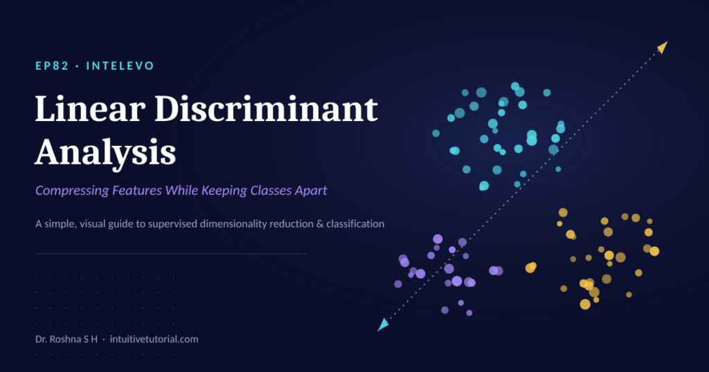
This article is the companion piece to Episode 82 of the Intelevo YouTube series. Watch the full video walkthrough first, then use this article to review the code, revisit the math, and take notes at your own pace. The video covers the intuition. This post covers the details.
So what is Linear Discriminant Analysis, really? Let’s find out.
A Quick Recap First
Two episodes ago, you met PCA. It squeezed correlated features into a few new axes. It kept the overall spread of the data. But it never looked at labels.
Last episode, you met t-SNE and UMAP. Both tools preserved neighborhoods. If two points sat close together in high dimensions, they stayed close in 2D. Still, neither tool checked the class column. They worked completely blind to labels.
Today, that changes. Linear Discriminant Analysis is the first technique in this series that looks at your labels on purpose. It uses them to choose the best possible axis. That single shift changes everything about how the technique behaves.
What Is Linear Discriminant Analysis?
Linear Discriminant Analysis, or LDA, is a supervised technique. It reduces the number of features in your dataset. However, it does something PCA never attempts: it optimizes for class separation.
In short, LDA asks one question. Which direction pushes different classes as far apart as possible, while keeping each class tightly bunched together? Once it finds that direction, it uses the direction as a new axis. Your data gets projected onto that axis. The result is a smaller, cleaner, more separable version of your dataset.
That’s the whole idea. Everything else in this article just adds detail to that one sentence.
The Big Idea: A Photographer Who Already Knows the Teams
Here’s an analogy that makes LDA click instantly.
Picture PCA as a photographer at a crowded event. This photographer rotates the camera, searching for the angle that captures the widest possible spread of people. The photographer has no idea who’s on which team. Spread is the only goal.
Now picture LDA. This photographer receives the team jerseys before taking a single photo. Armed with that information, the photographer searches for one specific angle: the angle where the red team clusters tightly on one side, and the blue team clusters tightly on the other. Between-team distance matters. Within-team spread does not.
That one best angle becomes the new axis. Consequently, when you project your data onto it, classes separate cleanly. This is precisely why LDA plots often look far tighter and more organized than PCA plots for the same dataset.
In Plain Words: What LDA Actually Optimizes
Let’s translate the photographer analogy into a single, memorable sentence:
LDA finds the axis where classes sit as far apart as possible, while each class stays as tightly bunched together as possible.
Three things follow from that sentence:
- It maximizes between-class spread. Different group centers get pushed apart along the new axis.
- It minimizes within-class spread. Points from the same class stay huddled around their own center.
- It assumes classes are roughly bell-shaped, with similar spread. This assumption isn’t perfect. Still, it holds reasonably well for most real-world datasets.
Notice the contrast with PCA. PCA never asks “which group does this point belong to?” LDA asks that question first, and everything else follows from the answer.
A Worked Example: Housing Data With Known Neighborhoods
Let’s reuse the housing dataset from earlier episodes, since consistency helps build intuition. Each row still describes a house: square footage, bedrooms, bathrooms, and garage size.
Previously, four hidden neighborhoods sat inside this data. t-SNE and UMAP had to discover those neighborhoods on their own, using nothing but feature similarity. This time, the neighborhood label ships with the data. LDA receives it directly.
| House ID | Sqft | Bedrooms | Bathrooms | Garage | Neighborhood |
|---|---|---|---|---|---|
| 1 | 1,340 | 3 | 2 | 220 | Hillside |
| 2 | 2,105 | 4 | 3 | 440 | Downtown |
| 3 | 980 | 2 | 1 | 0 | Suburbs |
| 4 | 1,760 | 3 | 2.5 | 380 | Lakeside |
That single extra column, Neighborhood, changes the entire problem. Because the answer key exists up front, LDA can aim directly at the split that PCA and t-SNE never targeted.
The Four-Step LDA Pipeline
Every run of LDA follows the same four-step shape. Understanding these steps removes the mystery from the algorithm.
Step 1: Find each class mean. LDA computes the average feature values for every neighborhood. Think of this as each neighborhood’s center of mass.
Step 2: Measure within-class spread. Next, LDA checks how tightly each neighborhood’s houses cluster around their own center. Tighter clusters are better.
Step 3: Measure between-class spread. Then, LDA measures how far the neighborhood centers sit from each other, and from the overall dataset center. Bigger gaps are better.
Step 4: Solve for the best axis. Finally, LDA picks the exact direction that makes between-class spread as large as possible, relative to within-class spread.
Unlike t-SNE, which nudges points around iteratively in a slow tug-of-war, LDA solves this directly. There’s no trial and error involved. One calculation produces the answer.
Linear Discriminant Analysis in Python, Step by Step
Now let’s move from theory to code. This section mirrors the three code walkthroughs from the video.
Step 1: Fit LDA on the Labeled Features
from sklearn.discriminant_analysis import (
    LinearDiscriminantAnalysis)

lda = LinearDiscriminantAnalysis(
    n_components=2
)
X_lda = lda.fit_transform(
    X_scaled, neighborhood)
Notice something important here. Unlike PCA, fit_transform takes two arguments instead of one: the scaled features, and the neighborhood labels. LDA needs both, because it can’t separate classes it never sees.
Also, n_components caps out at the number of classes minus one. With four neighborhoods, three axes represent the maximum. This example keeps two components, purely to make the plot easy to read.
Finally, always scale your features first. LDA is just as sensitive to differing units as PCA and t-SNE are.
Step 2: Plot It and Watch the Neighborhoods Separate
import matplotlib.pyplot as plt

plt.scatter(
    X_lda[:, 0], X_lda[:, 1],
    c=neighborhood,
    cmap="tab10"
)
plt.xlabel("LD1")
plt.ylabel("LD2")
The new axes carry new names: LD1 and LD2. Each one represents a blend of the original features, chosen specifically to split the classes apart.
Compared to PCA, expect noticeably tighter, cleaner clusters here. That result isn’t an accident. Separating classes was the explicit goal from the start. Also, unlike t-SNE, these axes stay stable and meaningful across runs. They aren’t just a random layout that happens to look nice.
Step 3: Use the Same Model to Classify a New House
new_house = [[1500, 3, 2, 300]]
new_scaled = scaler.transform(
    new_house)

prediction = lda.predict(
    new_scaled)
print(prediction)
Here’s the part that truly sets LDA apart from PCA, t-SNE, and UMAP. The predict method works because LDA is secretly a classifier too. The exact same axes it built for visualization also draw the decision boundaries used for classification.
In other words, one model does two jobs. Use fit_transform to visualize your data. Use predict to classify brand-new data points. No other technique in this series offers that combination.
The Math Behind LDA, in Plain English
You don’t need heavy math to use LDA well. Still, one core idea is worth understanding, because it explains everything the algorithm does.
LDA relies on two quantities:
- Between-class scatter (Sb): how far the neighborhood means sit from the overall mean. This number represents the separation we want to maximize.
- Within-class scatter (Sw): how much each neighborhood’s own houses spread around their neighborhood mean. This number represents the noise we want to shrink.
LDA then solves for the axis that maximizes the ratio between these two quantities:
J(w) = Sb / Sw
This equation is called Fisher’s criterion. That’s genuinely the entire idea. No new arithmetic exists beyond this one ratio. Once you understand that LDA maximizes Sb divided by Sw, you understand the mathematical core of the algorithm.
A Rule Most People Miss: How Many Axes Can You Get?
Here’s a limitation that catches almost everyone off guard the first time.
PCA can build as many components as you have features. There’s no hard ceiling. LDA works differently. It caps out at the number of classes minus one, no matter how many original features exist.
Consider our housing example again. Four neighborhoods exist. Therefore, LDA can build a maximum of three useful axes, regardless of how many features you started with. If your problem only has two classes, LDA collapses down to a single axis: one line, and nothing more.
Before you plot your results, always check the components_ attribute. Otherwise, you might expect more axes than LDA can actually deliver.
LDA vs PCA: A Quick Side-by-Side
Both techniques compress features into fewer axes. Still, they optimize for completely different goals.
| PCA | LDA | |
|---|---|---|
| What it optimizes | Total variance, ignoring labels | Between-class separation, using labels directly |
| What it needs | Only features | Features plus class labels |
| Best for | General compression, noise reduction | Classification-ready plots, fast baseline classifiers |
Use PCA when labels don’t exist yet, or when general compression is the goal. Use LDA when labels exist and classification is the target. Choosing correctly here saves considerable time downstream.
Common Mistakes to Avoid
LDA performs beautifully when its assumptions roughly hold. However, it can mislead you quietly when they don’t. Watch for these three pitfalls.
Assuming equal spread across every class. LDA assumes each class shares roughly the same spread. When spreads differ wildly, consider Quadratic Discriminant Analysis instead.
Expecting curved decision boundaries. LDA only draws straight lines. Consequently, classes that twist around each other in feature space need a non-linear method.
Trusting mislabeled data. LDA trusts your labels completely, with no built-in skepticism. As a result, mislabeled classes actively pull the axis in the wrong direction, quietly corrupting your results.
Real-World Uses of Linear Discriminant Analysis
Because LDA optimizes for separation and hands you a working classifier for free, it shows up in places far beyond simple plotting.
Face and pattern recognition. The classic Fisherfaces method is literally LDA in action. It finds the exact axes that separate one person’s face from another’s.
Fast, interpretable baselines. Before reaching for anything heavier, many practitioners try LDA first. It’s often surprisingly hard to beat, especially on smaller, well-behaved datasets.
Preprocessing for other models. Instead of feeding raw features into a downstream classifier, teams often feed LDA’s compact, class-aware axes instead. This step frequently improves both speed and accuracy.
Key Takeaways
Let’s lock in everything you should remember from this article.
- Scale your features first. LDA remains just as sensitive to units as PCA and t-SNE.
- LDA maximizes between-class spread while minimizing within-class spread. One ratio, Fisher’s criterion, captures the entire idea.
- Your axes are capped at classes minus one. Always check
components_before plotting. - LDA works as both a dimensionality reducer and a classifier. Use
fit_transformto see your data. Usepredictto classify new points. - Straight lines only. Curved class boundaries require a different technique entirely.
Frequently Asked Questions
Is Linear Discriminant Analysis supervised or unsupervised? LDA is supervised. It requires class labels during training, unlike PCA, which needs only features.
Can LDA handle more than two classes? Yes. LDA handles multiple classes easily. However, the number of usable axes never exceeds the number of classes minus one.
Does LDA work for both classification and dimensionality reduction? Yes, and this dual role is exactly what sets LDA apart. The same fitted model reduces dimensions through transform and classifies new points through predict.
When should I choose LDA over PCA? Choose LDA whenever labels exist and classification-ready separation matters. Choose PCA when labels don’t exist, or when general variance-based compression fits your goal better.
What happens if classes have very different spreads? Standard LDA assumes similar spread across classes. When that assumption breaks down badly, Quadratic Discriminant Analysis usually performs better.
What’s Next: Model Interpretability with SHAP and LIME
LDA is transparent by design. Its axes and boundaries exist as visible, inspectable math. Most machine learning models, however, aren’t nearly so transparent.
Episode 83 opens the black box. Using SHAP and LIME, you’ll learn how to explain individual predictions from any model, no matter how complex that model happens to be internally. If today’s episode taught you how a model separates classes, next episode teaches you why a model made one specific decision.
Watch the Full Video
This article summarizes Episode 82 of the Intelevo YouTube series. For the full walkthrough, including live code demonstrations and visual explanations of every concept above, watch the complete video on the Intelevo YouTube channel.
If this article helped you, consider sharing it with someone learning machine learning right now. Feedback and questions are always welcome in the comments section of the video.